The more we live our lives on our smartphones, the more we are beginning to realize that we spend the vast majority of our time sat looking at whatever home screen adorns our devices. Whether your particular poison is Android, iOS or Windows Phone flavored, the chances are you spend a fair chunk of your time navigating the pile of icons, widgets or tiles that make up your home screen.
Smartphone makers are also beginning to come to the same realization. With the likes of HTC and Samsung customizing the stock Android experience to help differentiate, Google itself improving the stock home screens over the years and Microsoft filling its own home screens with live tiles, it is clear that a simple list of apps just won’t cut it anymore. We’re looking at you, Apple.

Here we take a quick tour of what each of the three major players in the smartphone market deem to be the best home screen solution. Apple’s iOS 6, Google’s Android 4.0 and Microsoft’s shiny new Windows Phone 8 will be the software we look at and it is worth remembering that two of these have yet to be released – anything and everything could change between now and the software being made available to the public. Still, we think it better to compare the latest versions to be shown off, so there you go.
iOS 6
The oldest of the three major smartphone operating systems, iOS is what drives not just Apple’s iPhone, but also its tablet device, the iPad. Whilst iOS is the oldest, it is also one of the most improved since its original inception back in 2007. The home screen though has remained largely unchanged since that time. By largely unchanged, we mean it has remained completely unchanged.
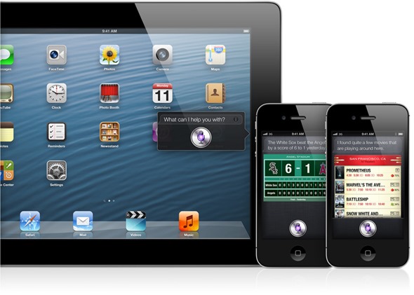
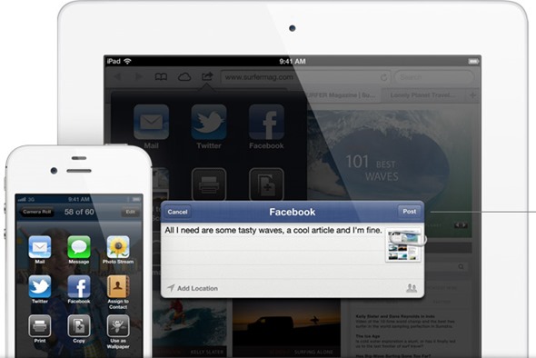
OK, so we’re possibly being a little harsh on Apple’s developers. While it is indeed true that the actual home screen has not changed a great deal in five years, if at all, Apple did add some much needed notification management to iOS 5, and has taken things a step further with the unreleased iOS 6. Similar to Android’s solution, the Notification Center houses all push notifications (should you so wish – they can be turned on and off on a per-app basis) as well as two new buttons. One of these buttons gives users quick access to sending new tweets, while the other, predictably, allows quick status updates to be pushed to Facebook. Keeping your Twitter and Facebook friends apprised of what you are up to is never more than a few taps away.
As far as the actual app launcher is concerned, you’re left with a Dock across the bottom that always shows the same four icons no matter which home screen you are on and a grid of apps above that. Icons can be placed into folders and moved around, should you want to keep all your social networks apps in one place for example.
Apple has been mocked for its lack of willingness to change the way iOS looks and feels over the years, with some important updates missing amongst the ones that have arrived. With Windows Phone 8 very much ‘alive’ with real-time updates and colorful icons, iOS is arguably beginning to look a little dated. It isn’t harming sales, though, and for all its whiz-bang showmanship, Windows Phone isn’t exactly selling by the truck load, is it?
Android 4.x Ice Cream Sandwich
With the next version of Android set to be called Jelly Bean and announced at the upcoming Google I/O event, Ice Cream Sandwich may soon be yesterday’s news, but until then this is the newest, shiniest version of Android there is. Not that many people have it, as the Android version number by user percentages like to show. Still, if you’ve got it, it’s pretty sweet depending on what skin is sat on top of it.
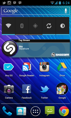
Similar to iOS, Android sports a collection of home screens which can be home to a collection of icons, all pointing to an app. Where Android differs though is the ability to add widgets to that homes screen. You can have clocks, weather notifications and the like, as well as quick access to your social media streams or music controls. There really is a plethora of widgets out there, and the chances are you’ll find one to suit your needs.
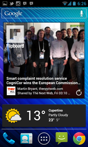
Just like iOS – in fact, Android did it first – Android features a pull-down drawer that plays host to all your notifications. They may be handled slightly different to iOS, and they certainly do not offer the same granular control as Apple’s implementation, but they work.
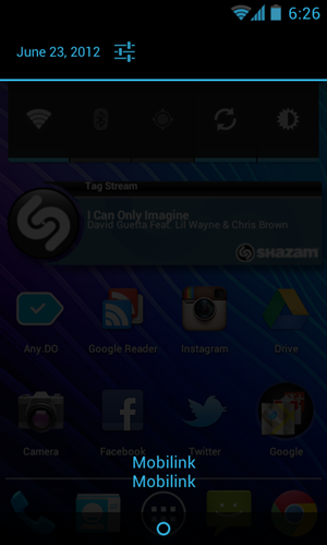
Icon arrangement can depend on the skin you happen to have installed on your smartphone of choice, with some allowing more icons and widgets on-screen than others. Being able to install different launchers, though, means Android phone owners have the power to customize almost every facet of their home screen experience. Not something that either iOS or Windows Phone owners can say.
Windows Phone 8
Something of an unknown quantity, Windows Phone 8 is the update to the Windows Phone platform that is still waiting to take off. That failure to launch is evident despite Finnish giant Nokia throwing all its chips behind Microsoft and then putting out some pretty impressive hardware to back it up. Microsoft, and Nokia, are hoping that Windows Phone 8 will be a hit.
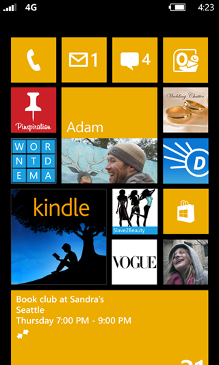
As far as the home screen experience is concerned, Windows Phone 8 is set to be the most ‘live’ experience to date. With Live Tiles constantly updating to reflect statuses rather than simply being dumb icons, users can have constantly updating data right on their home screen. Windows Phone 8 adds the ability to move and resize Live Tiles, meaning that users can choose to have one massive tile that displays recent emails, for example, meaning they don’t need to launch an app just to read the latest addition to their inbox.
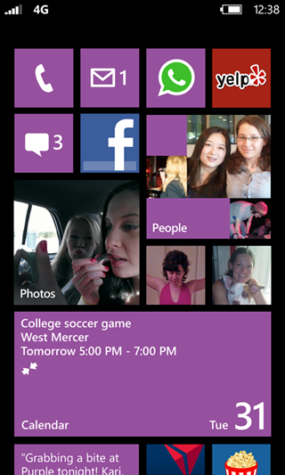
The whole Live Tile experience lends Windows Phone something of an ‘online’ feel. The handset almost feels alive because the home screen is constantly updating with new data, new colors and fancy images. It can be a little busy at times, but you pays your money, you takes your choice.
Wrap-up
Which home screen is for you will probably depend on which platform happens to be your favorite. Choosing Android, iOS or Windows Phone based on just the home screen is impossible, as it is the app ecosystem, the hardware and the community support that makes a smartphone platform what it is. Icons on a screen sure do help, though, and if we could combine all three into one then we would be onto a winner.
Until then, carrying three phones around is the only way to be sure!
For discussion on this topic: Check out the threads on Facebook or Google+.
You may also like to check out:
You can follow us on Twitter, add us to your circle on Google+ or like our Facebook page to keep yourself updated on all the latest from Microsoft, Google, Apple and the web.

