I have always loved the Media Center user experience since its inception in the days when it came bundled with Windows XP Media Center Edition. Windows Media Center is really a highlight of Microsoft design. With Windows 7, Microsoft has made some minor changes to optimize the UI of Media Center to make it more suitable for touch enabled devices. The noticeably larger fonts also makes it easier for viewing from the comfort of your couch.
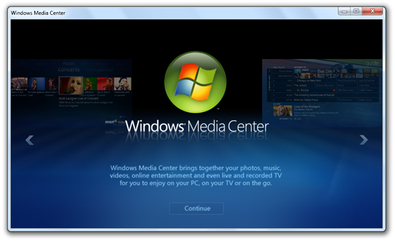
Here are the few screenshots from Windows Media Center in Windows 7 Build 7022:
Windows Media Center in Windows 7 gets a new getting started wizard.
Larger fonts makes it easier to navigate Windows Media Center with touch-enabled devices. It also makes it easier for viewing from the comfort of your couch.
Windows Media Center finally gets its own Movies Library.
You can now easily control what shows off on your Media Center start menu.

