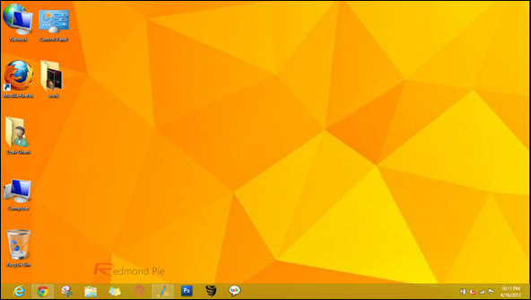
According to a new report, Microsoft is planning to bring the long lost Start Orb button back with Windows 8.1 later this year. Is it a good move? Is Microsoft trying to lure back users they lost over the past months?
The Start button had been a part of Windows since the inception of Windows 95 when it was released back in 1995. Yup, that’s 17 years ago if you’ve been marking your calendars properly. Over time, for users, it had evolved as the first go-to place for getting any sort of work done.
With the release of Windows 8 in October last year, Microsoft brought to the scene the Metro / Modern-ridden Start screen. For some, it was a big treat, for others, a big horror. I’ve even ranted about it a while back. The removal of the Start button proved to be a big pain for a lot of traditional PC users, and I was one of them. For Microsoft, the sole purpose was not just to bring a fancy UI to the table, but to make one hybrid OS for both desktops/notebooks and Tablets. But has Microsoft succeeded in doing that?
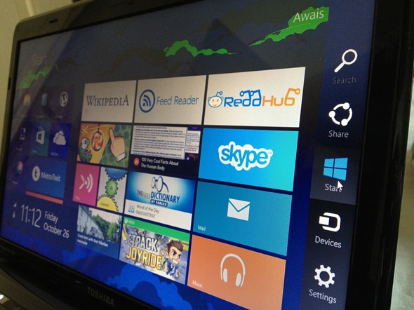
If you’re a tablet user, then the new touch optimized Start screen makes a lot of sense; it’s fast, fluid and snappy. Checking emails, browsing the web, reading your tweets and whatnot doesn’t get easier than this on a touch screen PC. But what if you’re a traditional PC power user? You multitask like there’s no tomorrow. You want powerful apps running side by side etc. You need that Start button + menu on the bottom left-hand corner to access your desktop apps without having to jump into that awful Modern UI.
Now, according to the report which TheVerge published today, the Start button in Windows 8.1 will be a mere button which would just take you to the Start screen, nothing else. It wont include the familiar Start menu you have been so used to in the pre-Windows 8 era. A single click on the Windows logo in v8.1 will take you to the Modern UI Start screen, nothing more, nothing less.
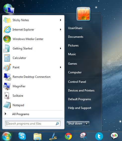
If that is the case, then it is just silly for Microsoft to include it. I’m not speaking for everyone here, but I clearly don’t want a button which would just take me to a place where I don’t want to be in the first place, the Modern UI. I want a button which would open up the Start menu, which in turn would show me my recently opened apps and documents without the Metro / Modern stuff around it on my PC without touch screen. I want that set as default in Windows 8.1 for desktops and notebooks which are meant to be used with keyboard+mice. For Tablets and other touch-optimized PCs, yes, the Modern UI Start screen makes sense, and should be set as default.
Recently, We also reported about Microsoft planning to bring an option in Windows 8.1 which would allow users to boot directly to the traditional desktop environment, skipping the Start screen altogether on first boot. This move somewhat defines the fact that Microsoft might just be regretting their Metro / Modern decision after all, and a majority of its users aren’t sold to the new UI, just yet.
Are you excited about Microsoft bringing the Start button back in Windows 8.1? Or are you not bothered at all and love the way how Windows 8 is in its current form? Let us know about it in the comments section below.
You can follow us on Twitter, add us to your circle on Google+ or like our Facebook page to keep yourself updated on all the latest from Microsoft, Google, Apple and the web.

