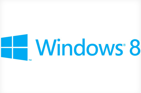
A day after Apple presented its forthcoming Mountain Lion OS to the world, Microsoft has given PC users something to mull over by unveiling the Metro-themed Windows 8 Logo.
Although Windows 8 will boast faster boot-up times than the preceding iterations, one of the standout features is undoubtedly the Metro user interface, which has gone down well with punters in the early dev alpha as well as on Windows Phone, which received the honor of ‘Smartphone Operating System of the Year’ in 2011.
The familiar START button (and orb, for the more recent Vista and 7) will be ditched completely as Microsoft bases appearance and functionality on tiles, tiles and, well, more titles. First leaked on the interwebs earlier on in the week, the software maker has scrapped the omni-present flag found in earlier versions of Windows.
"We wanted the new logo to be both modern and classic," said Microsoft’s Sam Moreau on the official Windows blog. The window is slanted somewhat, in keeping with the manner in which many of the Metro UI’s elements – such as live tiles – behave.
Whilst opinion on the logo appears to be rather mixed, it is accurately representative of the Metro interface seen throughout Windows 8 – using basic colors and clean lines in what is easily the Redmond company’s prettiest operating system to date. The logo will change color based on the theme used, and as Moreau puts it: "When you change your color, the logo changes to reflect you." The Windows 8 Consumer Preview, which is due on February 29th, is expected to pack the logo.
While Mountain Lion has left many an OS X fan salivating in anticipation, Microsoft reminds us that there’s another gorgeous OS on the way – although the likelihood of an official release before Q4 seems doubtful. Microsoft is following in the Cupertino company’s footsteps with a dedicated Store for apps – as well as intense integration with other branded devices. Windows is the undisputed king of the computer OS market, but with the iOS-meets-OS X Mountain Lion just a few months away, Apple could take a serious chunk of Ballmer’s business.
What do you guys make of all this. Is the clean-cut, simplistic Windows 8 logo taking your fancy, or is it a little too plain and underwhelming? Leave your thoughts via our Facebook and Google+ pages as usual.
(via The Verge)
You can follow us on Twitter, add us to your circle on Google+ or like our Facebook page to keep yourself updated on all the latest from Microsoft, Google, Apple and the web.

