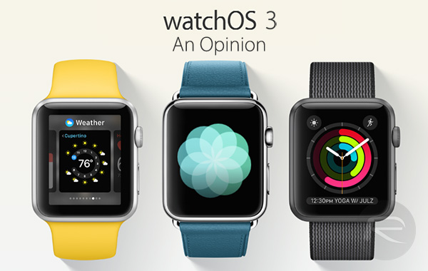
Apple’s Worldwide Developers Conference (WWDC 2016) opening keynote had a lot to announce, and the updated software for the Apple Watch was perhaps one of the lesser lights in what was an otherwise impressive set of announcements. watchOS 3 for Apple Watch should not be underestimated, however, because at a time when many are putting their Apple Watches away for good, or bad, depending on how you look at it, anything that can give the product a much needed shot in the arm before the arrival of second-generation version should be grabbed with both hands. With watchOS 3, that’s exactly what Apple has done.

I’ve been using watchOS 3 for a week or so now, and alongside iOS 10 on my iPhone 6s, things have been working surprisingly well so far. In fact, I’ve not had watchOS crash on me yet, and while iOS 10 has had its issues, these two releases really are some of the more improved, more solid and more stable releases we’ve ever seen from Apple.
Having used watchOS 3 for a week or so, I’m going to jot down just a few things that have caught my eye so far. I use my Apple Watch for notifications more than anything, so I have never been tempted to ditch it. If I’d been a bigger user of apps, though, well, things might have been very different.
So, watchOS 3.
Speed
They said watchOS 3 was fast, and they were not lying. Even without apps not yet having been written against watchOS 3, it’s impressive how quickly things launch and refresh when an app is added to the new Dock, which can be accessed from anywhere using the side button under Digital Crown. It’s not instant, but it’s not far off and it’s, without a shadow of a doubt, a massive improvement.
Speaking of the Dock, any app you might use is best placed in the Dock in order to benefit from faster loading times and background updates – both big wins for the Apple Watch. However there’s a limit to the number of apps you can put in the Dock, which currently is set to ten apps.
Glances? What Glances?
Starting from watchOS 3, Glances are gone for good. I’ve not missed Glances once, and that’s because of the speed at which apps can launch. Normally, I would use a glance because launching an app took too long. Not anymore.
The Side Button Should Have Always Accessed The Dock
Or if not the Dock, anything else – anything that wasn’t the Friends interface. That was poor in the extreme, and I’m fairly sure nobody outside Apple used it. Digital Touch is still there if needed. It has now been moved to become part of Messages app, just like how it is on iOS 10.
Watch Faces Are Still A Bit “Meh”
I like the new watch faces Apple has introduced in watchOS 3, but there are still not enough. I could actually become addicted to mixing it up. A store of some sort would definitely see me spending real money on digital watch faces for my Apple Watch. A missed opportunity?
Writing On Your Watch Works Well
Using the new ability to physically write text onto the Apple Watch in order to reply to a message is surpassingly fun, easy, and accurate. And this is still beta 1!
I haven’t used any of the new fitness features yet, and some things like the ability to automatically call emergency services isn’t live yet, so bear that in mind. Overall things are looking great for watchOS 3, especially considering its infancy. What I will say is this – if you’ve ditched the Apple Watch of late, you might want to fish it out again and wait for watchOS 3. It’s going to be that good. It’s going to be a game changer.
You may also like to check out:
You can follow us on Twitter, add us to your circle on Google+ or like our Facebook page to keep yourself updated on all the latest from Microsoft, Google, Apple and the Web.
