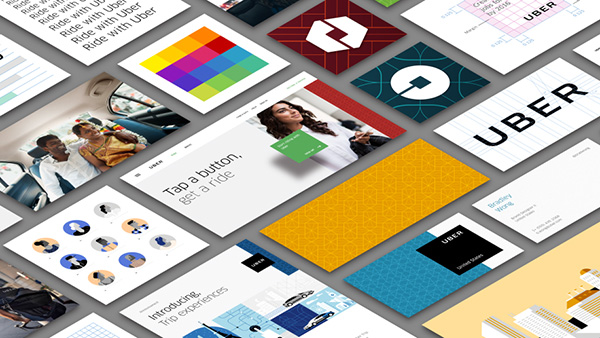
Uber may be under attack by its own drivers as well as anyone who it’s in competition with in many major cities around the world, but that isn’t going to stop the company from letting the designers out of their cage, with Uber today announcing a few changes to its logotype, app icons and other parts of its identity.
Keen to make sure everyone is up to speed with what has been done, Uber has published a blog post to show just what it has been up to, complete with suspiciously over-produced videos explaining just what is going on. Normally, we’d welcome such clarification, but having watched the videos Uber has to offer, we’re more confused now than we were beforehand.

The easiest change to understand is Uber’s new logotype, which does away with some of the curly elements of the previous version, resulting in a tighter, more angular and arguably more masculine alternative. Uber says that its new logotype is easier to read at distance and when printed in small dimensions, which makes plenty of sense when you’re going to have it plastered all over cars that will be driving around at distance.
At this point, though, things start to get a little more odd. Uber is making a lot of references to the atom and the bit, which is apparently Uber’s way of likening itself to the combination of the digital and the physical. To that end, the bit is essentially a square box that will be popping up in the company’s online literature as well as at the center of the company’s new app icons, while the Atom is what Uber is… well, we’ll let Uber explain it.
The old Uber was black and white, somewhat distant and cold. This belied what Uber actually is—a transportation network, woven into the fabric of cities and how they move. To bring out this human side—the atoms—we’ve added color and patterns. The team has spent months researching architecture, textiles, scenery, art, fashion, people and more to come up with authentic identities for the countries where Uber operates.
So, yeah. There’s that.
![]()
Uber’s new app icons
Both the bit and the atom will make up Uber’s new app icons, one for its partners and one for riders. Both have the bit at their heart, and both will feature colors depending on the form in which Uber is operating.
Confused yet? Us too. Maybe it’s time to put those designers back where they came from.
You may also like to check out:
You can follow us on Twitter, add us to your circle on Google+ or like our Facebook page to keep yourself updated on all the latest from Microsoft, Google, Apple and the Web.

