Google’s design team has been on fire lately with Google+ and subsequent visual updates to Gmail and Google’s main page. YouTube is now getting a redesign too, codenamed Cosmic Panda, and yes, this one is open to the public.

As announced on YouTube’s official blog, Cosmic Panda is yet another design experiment aimed at making YouTube more user-friendly. Any YouTube user can simply head to YouTube.com/CosmicPanda to turn it on, or turn it off later if they’re so inclined.
What has changed in Cosmic Panda? The short answer is a lot: the channel pages have been redesigned, so have the video pages. The site now is now much more visually-appealing, with a navigation bar I actually enjoy looking at.

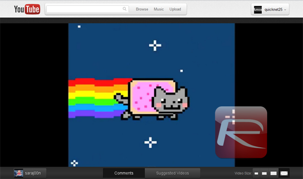
The new video pages are clearly focused on making video more prominent, as opposed to other aspects of the YouTube experience, although everything that’s important has been given a boost with this redesign. Users are also able to resize the video easily, to a greater degree than they did before, up to making it take up the whole browser window if they so wish; and as a bonus, the ad that appears on the side will be gone in this view.
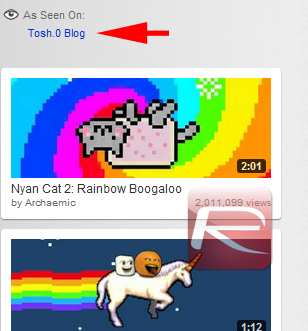
Video thumbnails are also about twice as big now, with a much more visible sidebar with related items and a new "As seen on" section, which seems to refer viewers to prominent places where the video was featured, such as TV shows. What seems to be gone is the ability to access videos from the same channel right on the video page, even though accessing the uploader’s channel is now easier than ever.
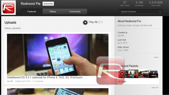
The channel page has been has received quite a refreshing upgrade as well. Over the years, YouTube has been progressively attempting to make videos take center stage on channel pages, and not the channel owner’s personal details. As it’s the case with the video pages, Google has taken the biggest step in years to make videos more prominent. Instead of a buggy and confusing link bank, videos now show up in a blog-like format, with all relevant personal details pushed to a sidebar on the right. There was always a sidebar, but it’s way better-organized in the new layout.
There don’t seem to be that many bugs with the current release, although don’t expect Cosmic Panda to be perfect just yet at this stage. Yet, those who have called YouTube "utilitarian" in the past might grow to love this new design.
You can follow us on Twitter or join our Facebook fanpage to keep yourself updated on all the latest from Microsoft, Google and Apple.

