The boot up sequence of an Apple Mac is an iconic thing. Everyone knows what that white screen and grey Apple logo means, and when that OS X wallpaper pops up you can even guess which version of the operating system you are using.
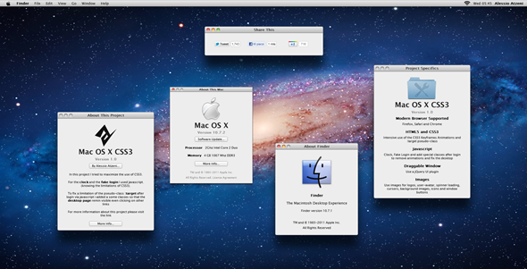
Take a look at the screenshot and you’ll immediately recognize OS X 10.7 Lion, along with the usual ‘About this Mac’ screen. But wait, there’s something different…

That’s because the entire thing, from top to bottom excluding a couple of images for icons, has been created using HTML5 and CSS3.
Put simply, the whole thing is actually a web page.
And it’s not static, either. Firing up the project will start you off with what appears to be a Mac’s power-on screen, which will eventually give way to an OS X logon screen. Entering the password of ‘admin’ will then cause the web app to launch what appears to be a Mac desktop.
HTML5 and CSS3 are two technologies that will allow web developers and designers to make more sophisticated websites, blurring the lines between the internet and ‘real’ applications. The demonstration, put together by Alessio Atzeni is there to give us all an idea of just what is possible if you know what you’re doing. There’s no doubt that Alessio Atzeni does!
You really need to give the thing a try yourself to appreciate it, but with web apps like this on the horizon, we have to wonder if Google has the right idea with its Chrome OS. If the web can really replace native applications then why would we need an operating system like we have today?
That may be some way off becoming reality, but we all know how quickly things can change in this game, don’t we?
We can’t wait to see how the web changes over the coming years.

I’m going to put it out there with a thumbs up that the developer has done a very good job at this. Although there’s not a lot you can do with it, and in no means this project is meant to give you a virtual second desktop, but, it’s a great way to get a minor feel of OS X before you go ahead with a purchase, provided that you plan to do it. Also, inspire other developers and designers to come up with ideas like these for websites.
This is something which Apple and Microsoft both should implement on their website to give new users a look and feel of their operating systems before making a switch.
You can take the project for a spin by heading over to this link. Head over here to read more about the project.
(via iClarified)
You may also like to check out:
You can follow us on Twitter, add us to your circle on Google+ or like our Facebook page to keep yourself updated on all the latest from Microsoft, Google, Apple and the web.

