One of the biggest challenges faced with using a Windows Phone device is the lack of customization options. The operating system is beautifully designed, there’s no denying that, but there’s pretty much nothing that you can do to spice up your Windows Phone experience. In Microsoft’s OEM partners, Nokia remains the only one that has had any luck changing some aspects of the operating system, but only within certain limits. Now, it seems that independent developers have taken it upon themselves to come up with concept apps that could actually serve as a guideline for Microsoft (or Nokia, for that matter) to understand how it’s properly done. Meet Nokia sWiPe, a new app debuted for free on the Windows Phone store that vitalizes the concept of a notification center on Windows Phone, as well as borrowing certain features from the likes of MeeGo. More past the jump.
The app primarily works with three major “screens”, with the the first one being the Glance Screen. Think of it as a replacement lock screen, which basically combines a home screen and a notification center. You may double tap here to fully turn the phone on, akin to the experience derived from Nokia’s MeeGo OS.

On the lock screen with Nokia sWiPe, you have various “swiping” options, where an upward gesture will show you the notification center. Swiping right brings you to the Start screen, left brings a new multitasking menu, while downward swipe will pull up Kids Corner.
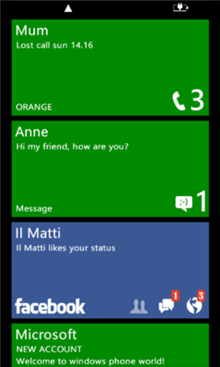
For the notification center, the developer has taken a different approach in comparison to other similar concepts. What it does is rearrange the existing live tiles on the basis of when it was updated, giving you a chronological overview of what was received when. This is not really the most ideal approach, considering the fact that the Live Tiles might not always be updating in real time, and the notifications that you’re getting might not always be up to date. That said, the concept is fresh, and definitely very welcome.
The multitasking menu (pictured above) is also different. It arranges four tiles of most recently accessed applications into a collage, reducing the number of swipes that would otherwise be required to reach the desired application. There are also music playback controls on this menu.
Nokia sWiPe is available for free at the Windows Phone Store, and can be downloaded on pretty much any device.
(Download: Nokia sWiPe for Windows Phone on Windows Phone Store) Thanks, Jim for sending this in!
Be sure to check out our Windows Phone 7 apps gallery to explore more apps for your Windows Phone 7 smartphone.
You can follow us on Twitter, add us to your circle on Google+ or like our Facebook page to keep yourself updated on all the latest from Microsoft, Google, Apple and the web.
