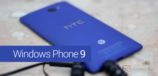
We’ve seen designers and digital artists share their own personal vision of what the future of Apple’s iOS will look like. We’ve witnessed what a potential touch-screen iMac could look like and we’ve even see a number of imaginative pieces that outline how a potential iOS or Android powered smartwatch could work. It’s very rare that designers, or general users for that matter, take the time to reimagine what Microsoft’s mobile operating system could be like, but that’s exactly what we have here with a Windows Phone 9 concept.
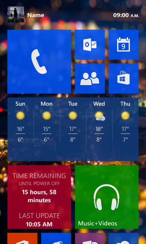
The individual behind this concept design hasn’t gone as a far as putting his own perspective across the operating system as a whole, instead chose to focus on one key area of the firmware. We think it’s also fair to say that a little bit of design inspiration has been taken from Apple’s introduction of blurring and transparency as part of the iOS 7 ecosystem. However, that shouldn’t detract from what is actually a very nice looking re-imagination of Windows Phone. The Windows Phone Live Tiles are one key area of the operating system users can’t get enough of, which is why they have benefitted from a slight visual change in this concept, and it’s fair to say that the designer has done a pretty good job at it.
The addition of a subtle transparency to the tiles adds a whole new dimension to the software by bringing the underlying wallpaper to life. Rather than seeing small snippets of the chosen wallpaper through the spaces in between the tiles, the proposed amendments mean that the underlying imagery shines through without taking the main emphasis away from what the tile actually offers. It is also being proposed that Windows Phone 9 should offer quick access to a “Me” page that acts as a sliding out drawer to hold options such as posting to Facebook, putting out a tweet to Twitter or interacting with a contact through WhatsApp.
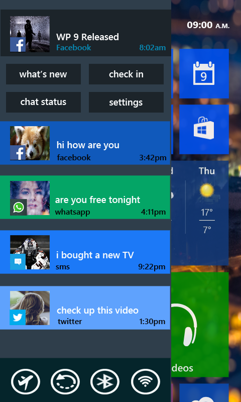
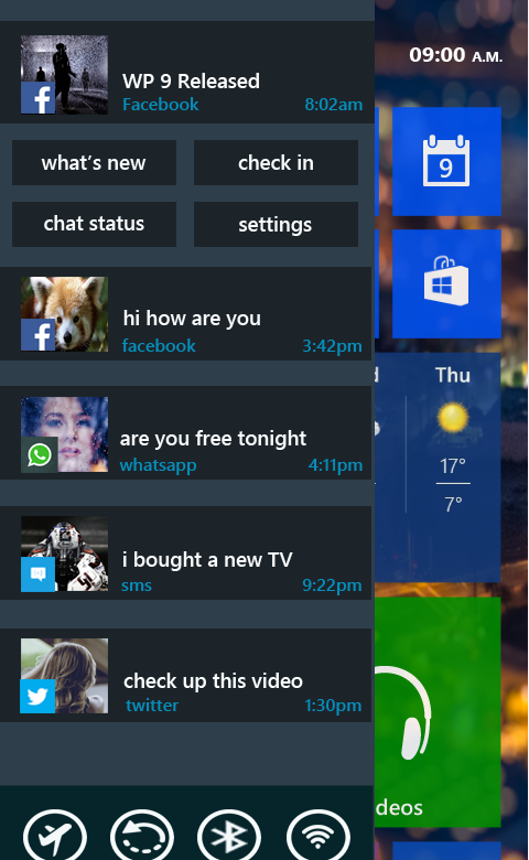
The slide-out drawer would also provide quick access to notifications as well as seeing any recent updates from all connected social accounts. It’s immediately evident that this concept hasn’t been produced by a professional or experienced UI/UX designer, but it does present a few interesting ideas that certainly wouldn’t look out of place on a future Windows Phone release.
(Source: Neowin)You can follow us on Twitter, add us to your circle on Google+ or like our Facebook page to keep yourself updated on all the latest from Microsoft, Google, Apple and the web.

