Concepts of how Apple should spruce up its notification system for iOS are nothing new. Since man first stood upright the world has wondered just what Apple was thinking when it came up with the obtrusive, modal system we all know and loath. Now another contender has thrown his hat into the ring – and it’s a beauty.
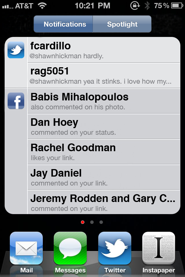
Put together by Shawn Hickman, the new concept is based around replacing the current iOS Spotlight screen with a hybrid Spotlight/Notification screen. This is where all your past notifications could be listed, solving the current issue of users potentially missing older popup messages.

Once in the notification screen, all messages would be grouped by the app that generates them, keeping all Facebook, Twitter, SMS etc. notifications together.
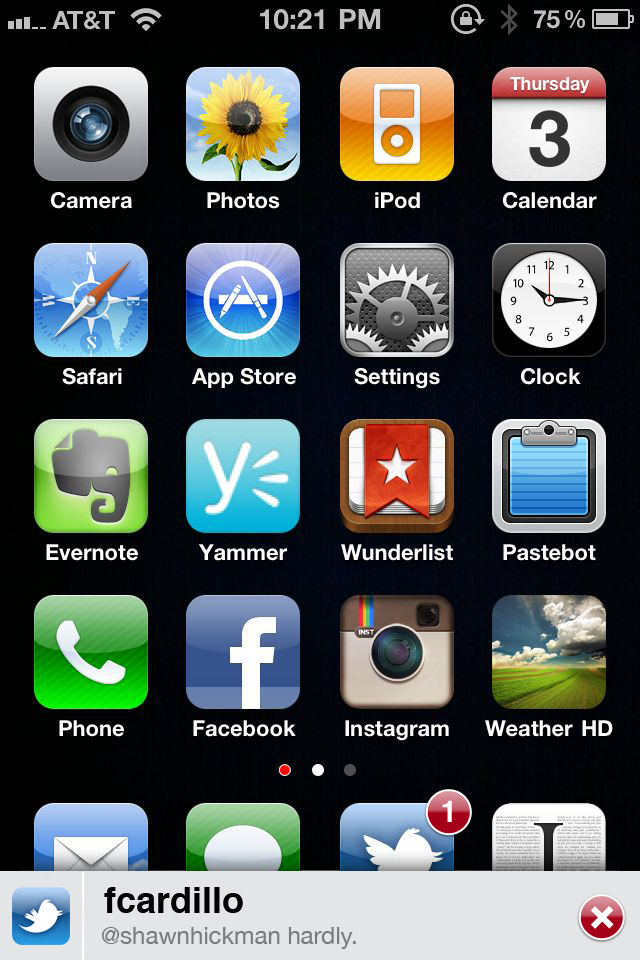
When a message arrives, the concept allows for a slide-up message coming from the dock area, which can either be opened or closed for acting on later.

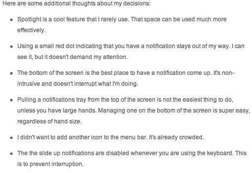
The reason for notifications coming from the bottom of the screen instead of a more Android-like approach is explained as an ergonomic consideration by Hickman, saying that ‘Pulling a notifications tray from the top of the screen is not the easiest thing to do, unless you have large hands. Managing one on the bottom of the screen is super easy, regardless of hand size’.
Hickman goes on to explain a few more design choices in his blog post.

We at Redmond Pie love the ideas put together by Hickman, and sure hope Apple does take note. Reports have circulated before that Apple is keen to bring iOS app Boxcar into the operating system, and few would disagree that something needs to change in the way iOS handles notifications.
Hopefully we’ll get to see a new notification system in iOS 5 sooner rather than later.
You can follow us on Twitter or join our Facebook fanpage to keep yourself updated on all the latest from Microsoft, Google and Apple.

