It’s quickly becoming a case of another day, another iOS 7 concept, and aside from the supposed flatness, improvements to Maps and recently revealed integration with social hunts such as Vimeo and Flickr, precious little is known of Apple’s forthcoming edition of its famed mobile operating system. All will of course be revealed at next month’s WWDC 2013, but until the calendar finally crosses the line for June 10th, all we can do is hope, predict and anticipate.
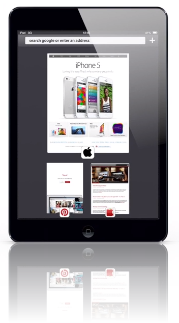
One aspect many have pointed to as requiring improvements is the Safari browser, and although it’s by no means the weakest part of iOS as a whole, it, like many areas of the mobile software, has been somewhat neglected through the generations. To try and offer a fresh outlook on proceedings, German designers have come through with a very interesting alternate look and feel to Mobile Safari for iOS 7. Details after the jump.
As was the case when Google dropped its Maps app for iOS last year, many iPhone, iPad and iPod touch users rejoiced at the news that Google had brought its Chrome browser to the Apple platform. Of course, thanks to the restricted API offered to those building third-party browsers, Chrome for iOS is nowhere near reflective of the experience on Android, but nonetheless, many feel it still eclipses the feature set offered by Safari.

Needless to say, it would appear Apple’s browser is in need of, at very least, a refresh, and this concept seems to does exactly that. Taking it from the top, this conceptualized Safari packs in an "omnibar" akin to both Chrome and the desktop version of Safari, and above all, one would hope Apple plans to bring this unifying experience to iOS 7.

Also thrown into the pot is a Dashboard-esque overview of all running tabs, meaning users can quickly and effectively jump from one to another. As you will see in the video demonstration below, it does work rather well, and would certainly enhance the general Mobile Safari user experience.
There’s also a card-like UI for viewing bookmarks, and with plenty of integrated gestures allowing everything to be navigated through with little difficulty, these are the kinds of changes that Safari could truly benefit from.
What are your opinions – is Safari really in need of some improvements? Or should Apple focus its efforts on sorting out Maps, skeuomorphism and multitasking (or lack thereof)? Share your thoughts below!
(via: Appleme.com – [Google Translate])
You can follow us on Twitter, add us to your circle on Google+ or like our Facebook page to keep yourself updated on all the latest from Microsoft, Google, Apple and the web.

