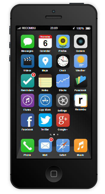
WWDC begins next week, and during the course of the past three or four months, we’ve covered literally dozens of concepts pertaining to the biggest talking point at Apple’s WWDC 2013: iOS 7. Designers have been working overtime to deliver their ideas and predictions in image and video form, but concept maker Steve King has gone a step further in creating an interactive iOS 7 concept which can be tested right now on a mockup iPhone 5S on the Web.
While some concepts have been enchanting, one that allows us to dive in and try it out firsthand is always going to be a winner, and King’s efforts created using a combination of HTML and CSS with a little bit of JavaScript certainly piqued our interest.
With Jony Ive now involved in the visual aspect of iOS 7, the OS is widely expected to adopt a much flatter, altogether less skeuomorphic appearance. The life-like stitching, gloss and paper effects will make way for clean lines, and although former iOS SVP Scott Forstall, like the late Steve Jobs, loved these realistic remnants, the consensus seems to be that the flatter approach will be one of aesthetic enhancement.
Steve King’s concept takes the purported new designs into consideration, and by pointing your browser to recombu.com/mobile/interactive/iphone-5s-ios7-concept/, you can play around with what he has come up with.
King has tweaked several aspects of iOS, including Messages, Camera, Phone, Calendar, Reminders, Notes, Mail and Safari, and while they operate similarly to iOS 6, the elements of each have been stripped of all unnecessary showiness to deliver a very clean, crisp user interface.
The pop-up notifications are a feature of iOS I have personally found to be of particular obtrusiveness, and while I would take a notification bubble any day of the week, the revamped pop-up design of King is much less offensive, and I actually enjoyed viewing, reading and closing the notification. So yes, Apple should take a lesson from this implementation.
It does look as though Apple is going back to basics in the design of iOS 7, and if it does wind up looking anything like King’s design, I think most will be relatively impressed.
What do you think – does this concept float your boat? Do share your comments below.
You can follow us on Twitter, add us to your circle on Google+ or like our Facebook page to keep yourself updated on all the latest from Microsoft, Google, Apple and the web.

