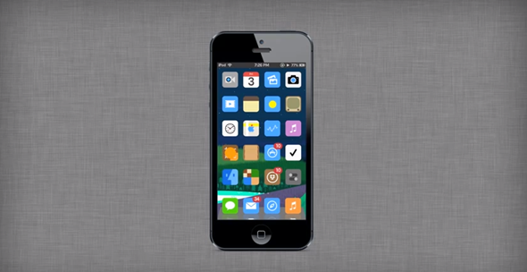
Much has been made of Apple’s intentions to bring a flatter user interface to iOS with the forthcoming seventh version, but opinion remains divided on whether skeuomorphism is actually all that bad after all. The two-sidedness of the debate created factions within Apple itself, with ex-iOS SVP Scott Forstall seemingly all for the replication of realistic materials while others, like lead hardware designer Jony Ive, were less enthused by the look. Taking into consideration the polarizing effect, concept maker Ran Avni has taken an interesting approach by suggesting a system which would effectually allow users to flit between flat graphics and the rather familiar look of iOS hitherto. Check it out after the break!
In order to hop between the traditional iOS visuals and the new, flatter aesthetic, a user would simply need to toggle the "iFlat" feature on or off from within the settings pane. As one would imagine, the result when the "iFlat" feature is activated is one of significant alteration, and although I wouldn’t necessarily like to cast a judgment on which I prefer, there is a certain degree of cleanliness associated with the flatter look.

Unfortunately for those dreaming of such an implementation, it’s not going to happen. How many times does Facebook change the look of a feature, much to the bemusement of many users? Several petition groups later, said users eventually realize that the changes were for the greater good, and guess what? They continue using the service as much as they did before.
What I mean is, if Apple’s going flat, it’s going flat – there are no half masts, and although the jailbreak scene could take something away from this concept in perhaps building a novel tweak to accommodate the two different looks, don’t count on it at stock level.

The WWDC logo (coupled with the fact that skeuo-hating Jony Ive is overseeing the look of iOS 7), indicates a flat design this time around, and although we’ll have to wait until this year’s WWDC in June before finding out exactly what else Apple has decided to throw into the mix, an overhauled interface design will almost certainly be among them.
What do you think of the concept would you like the ability to change between those two looks? Do share your thoughts below!
You may also like to check out:
You can follow us on Twitter, add us to your circle on Google+ or like our Facebook page to keep yourself updated on all the latest from Microsoft, Google, Apple and the web.

