When Tim Cook took to the stage on September 12th in San Francisco to introduce the iPhone 5, they unveiled what was essentially the worst kept secret in smartphone history. Although, we all pretty much knew what was coming with the elongated display of the sixth-generation iPhone, it didn’t reduce the excitement that was associated with seeing how Apple would handle the differences in display size between previous iPhone iterations and the new device.
Although Apple demonstrated the additional row of icons that would make use of the extra screen real-estate on the new iPhone, they didn’t really go into any great detail on how the extra 176 vertical pixels could be used to provide an enhanced user-experience. 176 pixels may not actually seem like a lot, but after using the iPhone 5 even for half an hour; going back to the iPhone 4 or 4S just seems like such a regressive step.
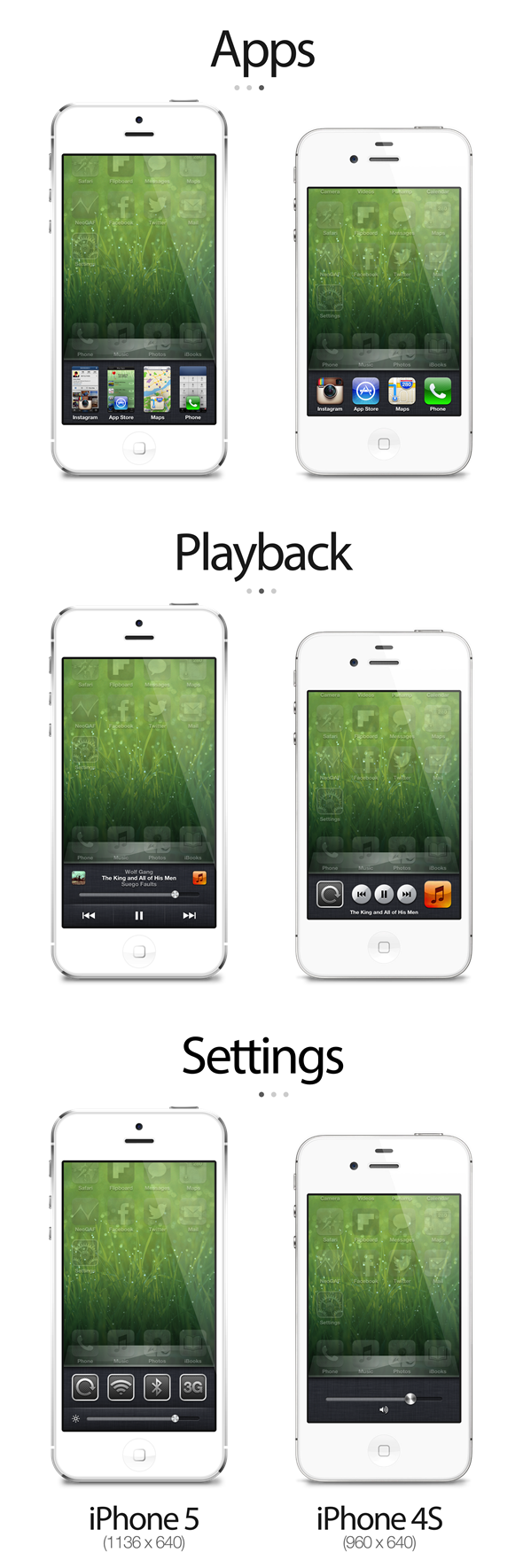
Some of us are already used to seeing certain parts of iOS being enhanced and altered through the installation of certain Cydia packages, and the multitasking switcher tray that was introduced as part of iOS 4 has certainly had its fair share of reworks over the years. A new and rather beautiful app switching concept shows us just what could have been achieved with iOS 6 and the iPhone 5, if a little bit of thought was applied to an age old problem. One of the most widely used functions of any iOS device is more than likely the multitasking ability that allows users to double tap the home button and quickly invoke a switcher bar at the bottom of the display that shows a horizontal scrolling list of currently running, but backgrounded apps.

The official iPhone 5 solution for multitasking is exactly the same as on an iPhone 3GS or 4S, with the additional pixels being ignored. This switcher concept aims to detect the type of device being used and presents a multitasking interface accordingly. Invoking the switcher tray will still have the same apps, music controls and settings options that users are used to, but when running on an iPhone 5; the larger screen would be more efficiently utilized by presenting a thumbnail tile of the running app rather than just the app icon.
The Settings section would also have space to display an additional row of frequently used system settings rather than just being able to adjust the device’s volume.
Finally, the music controls section allows for a more elegant layout that introduces now playing information, a volume slider and relocated media buttons for controlling the music. The concept is simple, intuitive and really makes use of the larger iPhone 5 display while still maintaining the core functionality of the switcher tray.
(via TheVerge)
You can follow us on Twitter, add us to your circle on Google+ or like our Facebook page to keep yourself updated on all the latest from Microsoft, Google, Apple and the web.
