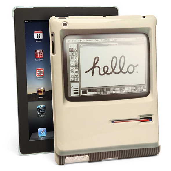
Do you remember 1984? It was the year Apple, under the effective management and public speaking skills of Steve Jobs, introduced the revolutionary Macintosh. It was the first mass market computer to come with a graphical user interface that made use of a pointing device named after an animal. A lot has happened at Apple since then, but some enthusiasts’ enthusiasm about the Macintosh still remains the same.
Well, if you bought a Macintosh then or were a big fan of its design, you’ll be interested to know that there is now a case for the iPad that makes it look like a Macintosh. Check it out after the jump.
The discovery comes from our friends over iMore in the form of a short post in which they discuss the case and its lovely design.
Named the Padintosh, the case’s back is designed just like the front of the Macintosh – with its clean, off-white color, uniformly rounded display edges, and the iconic floppy drive that makes it look like the Macintosh is smiling* at you.
Although not specified, it is made of a hard plastic material that is ultra light, durable and only 2mm thin. It also fits perfectly with a Smart Cover, so if you have an off white leather Smart Cover for your iPad 2 or new iPad (3) it should feel right at home with the Padintosh case.
When it comes to putting the iPad and Macintosh together, I feel nothing is as cool as an iPad put inside the hollow shell of a Macintosh, but that’s an altogether separate product category. Besides this, since my iPad is only used at home and by me and a couple of other, responsible adults, I’m against using a protective case for it since it spoils the beauty of its amazing design.
But that’s just me.
Padinstosh costs a reasonable $24.99. You can go ahead and order it from my personal favorite web service for getting geeky items: ThinkGeek.
*This was mentioned in Steve Jobs: A Biography. The front of the Macintosh was designed to attract people towards it, beckoning them to come and play with its intuitive user interface.
You can follow us on Twitter, add us to your circle on Google+ or like our Facebook page to keep yourself updated on all the latest from Microsoft, Google, Apple and the web.

