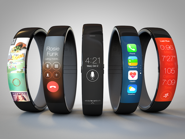
Nike’s FuelBand may be seen by some as a bit of a high-priced gimmick, but despite the naysayers, it continues to sell in fairly strong numbers. As well as building a growing number of admirers, FuelBand now arrives in a plethora of different colors and versions in the form of FuelBand SE, and is as stylish as it is practical. With this in mind, UI design guru Todd Hamilton has offered his take on the enigmatic Apple iWatch by basing it heavily upon close buddy Nike’s likeable gizmo, and the result is truly something to behold.
Although the Nike FuelBand is often forgotten alongside the Galaxy Gear and the Pebble when it comes to evaluating the smartwatch industry, there’s no doubt that the slick, stylish device is continuing to be a big hit with fitness fanatics and lazy slobs alike. Not only is the interface intuitive and quirky, but the device actually does what it purports to do – fancy that! But despite its popularity, it does feel like the FuelBand et al is all just early fodder for Apple’s supposedly imminent iWatch, which some predict will make an iPhone-like impact upon announcement.

When you look at what the iPhone and iPad did for the smartphone and tablet industries respectively (read: neither were, strictly speaking, the first of their kind in terms of categorization), it’s little wonder the industry is once again hyped at the prospect of a potential game-changer. And with guys like Hamilton running around putting such glorious faces to names, as it were, the iWatch fantasy is now going to be almost impossible to shake off.

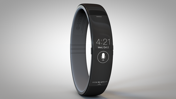
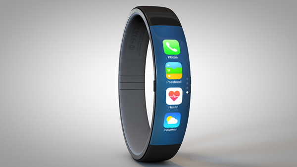
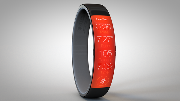
The iWatch concept is remnant of the FuelBand in almost every facet, but with a genuine (presumably flexi-AMOLED) display for an iOS-like UI, it still offers a familiar Apple experience from the get-go.


There is, according to Hamilton, a single home button on the left-hand side of the device, with two volume buttons located on the opposite side. There’s no doubt that it looks absolutely beautiful, and although it’s unlikely – even with the close relationship between Apple and Nike – that the iWatch would borrow so much of its design from the FuelBand, we can’t say that we’d be too deflated if it did.
What do you think – would you buy it?
(Source: ToddHamilton)
You can follow us on Twitter, add us to your circle on Google+ or like our Facebook page to keep yourself updated on all the latest from Microsoft, Google, Apple and the Web.

