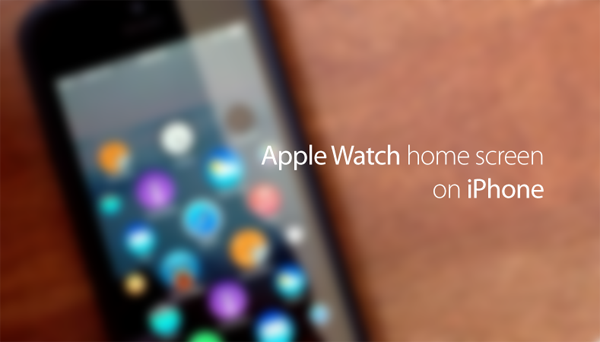
Apple’s first smartwatch, the Apple Watch, which was announced alongside the iPhone 6 and iPhone 6 Plus back last month, has been the subject of rave reviews by most of those who’ve encountered it, and it seems that both techies and watch aficionados have fallen for the charms of the device’s design, software, and general feature set. The UI, in particular, has garnered a fair bit of praise so far, and although we’ll personally reserve judgment until we’ve had a chance to use it in "early 2015," one designer has already dreamt up an interesting concept that imagines the wearable’s circular interface on the iPhone.
YouTuber Lucas Menge’s mock-up sees the Apple Watch flavor of iOS moved back to its spiritual home on the iPhone, and as you can see, it’s quite intuitive, and most of all interesting alternative look and feel compared with the stock iOS software.
Menge’s two-minute clip not only offers a possible glimpse into the future, no less because we can’t actually use the Apple Watch or its software at this moment in time, but to my eye, also points out how bland and uninspiring the iOS home screen remains at times. Apple has done a great deal to enhance the functionality of iOS 8, which is commendable, but seeing how the whole animation and behavior of the UI changes here, it does leave us quietly wishing that custom launchers had been a part of the iOS 8 third-party bonanza.
Nevertheless, with all the talk of iOS and OS X amalgamation, it seems that we now have another party to consider in what is a heavily-modified version of the traditional iOS software. It’s certainly plausible that some of Apple Watch’s software quirks could eventually be found elsewhere, but not perhaps to the degree as demonstrated by Menge.
Given the very limited display of Apple Watch, Tim Cook and Co. had to think up a concept that would still maintain usability, and that’s what makes this UI such a great and innovative construct. It’s nothing like any other smartwatch UI we’ve seen to date neither in terms of appearance or functionality, and although such a zoom-fest seems a little wasted on an iPhone that already has plenty of display real estate, this is still a pretty cool little mock-up:
(via: 9to5Mac)
You can follow us on Twitter, add us to your circle on Google+ or like our Facebook page to keep yourself updated on all the latest from Microsoft, Google, Apple and the web.

