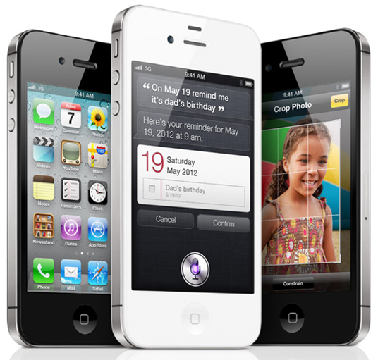
There’s no doubt that, when it comes to fanaticism of new products, Apple has it down to a fine art. From Mac to iPad, iPhone to MacBook, there’s regularly a congregation of avid techies ready to pay big bucks outside those iconic stores on release dates of new products.

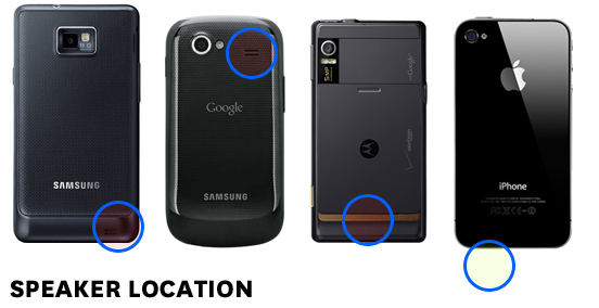
It’s no secret that Apple prides itself on bringing forth sleek, cutting edge technology, but a seldom acknowledged fact is that actually, the design appears to be a lot more practical and well thought-out. An interesting post by Dustin Curtis encapsulates this point, focusing on the position of the iPhone’s speaker, and why, although seemingly innocuous, it is actually perfectly positioned.
He pointed out that upon switching from the iPhone 4 to the Samsung Galaxy S II, because the speaker resides on the back of the device, he slept through his alarm, thus missing a meeting. Because he places his device in the corner of his bed, the soft surface muffled the speaker to the point of near silence. After several days with the Galaxy S II, concluding that maybe it was an isolated flaw with that device, he switched to the Google Nexus S.
Lo and behold, he experienced the same problem; in fact, it was worse still, since the device couldn’t muster much noise when placed even on a flat surface. The speaker positioning follows a similar trend for most Android-based devices – presenting a potentially problematic state of affairs. The iPhone however, has its speaker at the bottom of the device, rendering it near impossible to lose sound in the manner of Android devices.

Following a similar theme, Apple’s forward-thinking ways are also presented in the screen size, which hasn’t been augmented to the uber-large extent of many 4+ inch screens of Motorola, HTC and Samsung. Many questioned why, on the back of a 15 month wait, Apple did not increase the screen size with the iPhone 4S – a trend followed by Android manufacturers on a regular basis. The answer, once again, is practicality.
Curtis also brought to the world’s attention that whilst it’s all well and good having a screen resembling a desktop monitor, it’s actually impractical to those with regular sized hands. The radius covered by the rotation of the average thumb suggests a 3.5 inch screen as being a near perfect fit for most consumers.
(via iDownloadBlog)
You can follow us on Twitter or join our Facebook fanpage to keep yourself updated on all the latest from Microsoft, Google and Apple.

