Like most mobile device features, the idea of having a camera as a standard feature wasn’t one that occurred overnight. Many years of quite terrible cameras passed, amid cries of "it will never stick", "who needs a camera all the time?", and, the ironically overused "it’s just a novelty feature".
Of course, today it’s not a question of whether, but more a question of how good a camera on a new phone will be. As mobile cameras have now got to a stage where some of the best are catching up with the beefy, $1000+ professional standalones, quality is no longer the issue.
Since the typical smartphone camera now packs a mean punch (or should we say, shot), the problem is accessibility. In iOS, for example, many users complained that despite the camera managing to churn out beautifully-crisp images, the so-called ‘Kodak’ moment was often lost, since one needs to unlock, locate the Camera app, wait for it to load, and set HDR/video/photo/flash before taking the snap.

In iOS 5, Apple tried to resolve the issue, bringing a camera button to the homescreen, and then again in iOS 5.1, the Cupertino’s craftsmen altered the system once more. While the "slide-up for camera" gets the job done just fine, it’s not as smooth as it should be; it works, but doesn’t feel quite right.
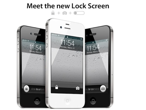
When something doesn’t feel right in iOS, something is usually done about it, and if the antidote isn’t in Cydia, well, the concept makers are still dreaming it up, and Bryce Kobayashi has done exactly that. His Press & Slide concept looks so well-placed on the iPhone Lockscreen, that it almost seems as if it were part of stock iOS.

Rather than making a user slide in different directions for different functions, Bryce’s concept places both camera unlock and device unlock in the same "Slide To Unlock" area. On the left hand side, there’s a padlock icon representing iPhone unlock, and on the right, a camera icon depicting the camera function. To unlock the device, you would tap the padlock and perform the normal slide, while to activate the camera, you’d simply tap the corresponding button, and slide in the opposite direction.
Polished off nicely with the new-ish circular toggles, we’d certainly love to see this implemented, but would you? Leave your thoughts via the usual mediums below!
(via CultOfMac)
You may also like to check out:
You can follow us on Twitter, add us to your circle on Google+ or like our Facebook page to keep yourself updated on all the latest from Microsoft, Google, Apple and the web.

