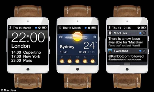
The claims that Apple is finally looking to bring an "iWatch" device to market seem to have gained some traction over the past couple of months. For years, fans have suggested the fruit company would bring some kind of wearable device to the mass market, and having seen the fanfare surrounding the Pebble Smartwatch, it seems as though Apple may be ready to silence the speculation and come through with a new product. Concepts of the iWatch have been aplenty, particularly of late, and this latest one courtesy of MacUser magazine is one of the best we’ve seen yet.
Personally, I haven’t found any of the bangle like iWatch concepts particularly desirable, but this, which uses a leather strap, is rather aesthetically-pleasing. I cannot help but think the face of the watch looks like an iPad mini that has been put in a tumble dryer for a prolonged amount of time, but considering how much the market seems to have taken to the Cupertino’s scaled down slate, I think this is a good move.
The design was carried out by designer Martin Hajek, who worked alongside the editors of MacUser to come up with this rather elegant look. What they were looking to do, and what I think they have managed to achieve, is a product which people would actually go out and buy. Thus far, while some iWatch concepts have looked interesting, it has been difficult to envisage many consumers parting with their cash to buy them, and as with the smartphone market on which the smart watch idea is based, fashion inevitably plays a part.
Hajek and crew have cleverly stuck with the traditional iDevice look, making it instantly appealing to those already in ownership of iPhones and iPads. With that said, apps still look as though they’re struggling to present themselves clearly on a display so minuscule, and it will be interesting to see – if Apple is indeed planning on such a device in the near future – how exactly the OS will run and how much the UI will have to be adapted.
It is said that a team of 100 is currently working on the iWatch, and with several respected publications seeming pretty sure the product exists and is being worked on, we’ll be keeping tabs on any further developments.
You can follow us on Twitter, add us to your circle on Google+ or like our Facebook page to keep yourself updated on all the latest from Microsoft, Google, Apple and the web.

