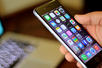
With Avengers: Infinity War now the big news across Hollywood, there is plenty to learn about the way the Marvel movies are made and no matter what the secret sauce is, it's clear it's working. This stretches all the way back to 2008's Iron Man release, and we have today learned what the inspiration was for Iron Man's HUD. As it turns out, it was Apple's iPhone.
Anyone who thought Apple opting for rounded squares as the basis of the iOS design aesthetic was just a case of Jony Ive or one of his designers liking rounded corners and deciding to run with it is actually quite wide off the mark. Here's the real reason.
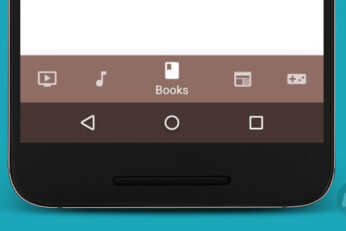
Google has released a new set of design guidelines that could see popular Android apps start to look a little more like they were designed with iOS in mind. Google's updated Android design guidelines now suggest that developers should, where suited, use the bottom of the screen in order to show buttons that allow the user to navigate through different parts of the app instead of hamburger menu.
Apple and Samsung’s trial is well under way folks, and we’re seeing plenty of juicy information come out of it. We’ve seen iPhone and iPad prototype from Apple, plans for an upcoming higher-than-Full-HD resolution tablet from Samsung, and now one of Apple’s design team members has discussed the design process that Apple goes through for new products.


