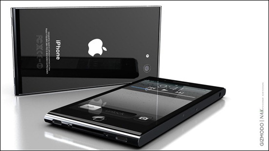
iPhone 5 concepts are a dime-a-dozen commodity these days. With only months to go before its rumored announcement, everyone and their mother seems to be trying their hand at a next-generation iPhone concept. Most fall flat on their face, but some of them emerge from the crowded pile and look good enough for us to believe that, well, this just should be it. One such concept was created by NAK Studios today and it looks stunning.
Before you start, be very clear with the fact that this is a concept. The actual iPhone 5 design is something, at this point, that only Jonathan Ive and his design team at Apple knows about.
The concept comes from NAK Studio’s Antoine Brieux. His concept of the iPhone 5 seems to be heavily inspired by, surprisingly, the 6th-gen iPod nano.
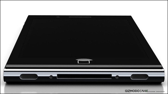
The concept iPhone 5’s body consists of a single Magnesium-alloy based casing which holds the electronics that is itself sandwiched between two pieces of glass. The glass on the front packs a 4” 1100-by-730 pixel display which is of the same pixel density as the current Retina Displays on iPhone 4/iPod touch 4G.
An iPhone 5 with a 4” 1100×730 display is very unlikely, mind you. The way they doubled the display resolution from 3GS to 4 was a genius move that Apple won’t replicate from 4 to 5 for the simple reason that Apple just wouldn’t want to break apps that currently work at 960×640 and 480×320 resolutions on the iPhone 4 and iPhone 3G/S, respectively.
The edges of NAK’s concept are sharp. And the corners, in a very un-Apple’ish way, aren’t rounded.
Overall, though, the phone looks like a lovechild of the Nokia N9 and the Sony Ericsson Xperia Arc, which, isn’t necessarily a bad thing.
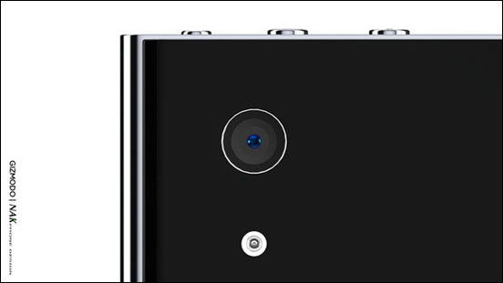
Here a few renders of the concept:
We’ve talked about plenty of iPhone’s potential new characteristics in the past. All of the recent rumor-based posts we’ve made so far were expertly rounded up in an infographic we covered on the 26th.
Of all the concepts we’ve talked about here on RP so far, today’s concept is my personal favorite. It may not be very original, it may not even be real… but by God, does it look astonishingly beautiful!
You can look at the renders in more detail at NAK’s official website.
(via Gizmodo)
You can follow us on Twitter or join our Facebook fanpage to keep yourself updated on all the latest from Microsoft, Google and Apple.


