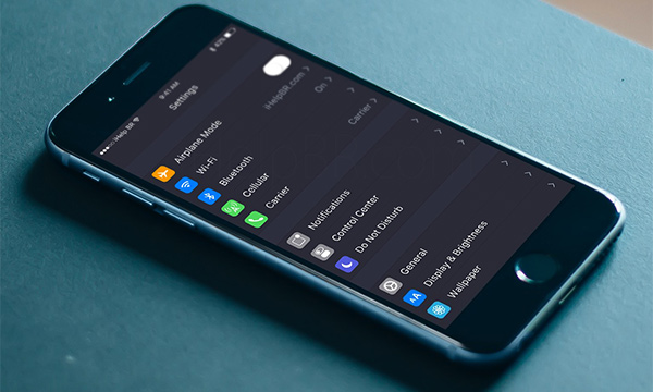
A new set of concept images released ahead of WWDC 2016 are hinting at the potential for some major visual and functionality changes within iOS 10. Apple has once again managed to raise excitement levels ahead of its annual developer event by launching a conference website and updating the WWDC app for iOS, both of which now feature a very dark user-interface.
As you might expect, the general public has put one and one together and arrived at the belief that there could be hidden meaning in those two customer-facing portals. These new concept images have been derived from this theory, thus culminating into an iOS 10 concept that features a native dark mode.

Apple’s mobile operating system has been through a number of changes over the years, the largest of which probably came when the Cupertino-based company decided to make the jump from a very skeuomorphic iOS 6 to a more flat and clinically designed iOS 7, full of clean lines and buttons.
With that said, in all of the years that Apple has been pumping out major and minor updates to iOS, the company has never seen fit to issue a full dark mode overhaul that would allow users to choose between a light or dark interface with which to interact with.
This latest concept attempts to imagine what iOS 10 would look like on a system-wide level if users had the option of putting iOS into a dark mode. As part of that imagining, the designer gives us a glimpse at what a dark mode could look like in stock apps, such as Mail, Messages, Contacts, News, and more.
We’ve seen many popular third-party apps, such as Tweetbot and Sky News, offer the ability to switch between a dark and light mode, but based on these images it looks like it could be an extremely welcome addition to the iOS platform.
Stepping away from the idea of a dark tint to the OS, the concept also introduces the idea of bringing various iPad-only features to the larger iPhone models within landscape mode. That would include support for Split View multitasking and Picture in Picture mode.
Given the size of the iPhone display, and the fact that both of these features take up a fair bit of screen real estate, it’s up for debate as to whether Apple would bring these features to the iPhone, but you can’t deny that it looks great in the renders.
(Source: iHelp BR [Google Translate])
You may also like to check out:
- What To Expect From Apple At WWDC 2016
- iOS 10 Beta Download, Release Date, Features And Rumors Update
You can follow us on Twitter, add us to your circle on Google+ or like our Facebook page to keep yourself updated on all the latest from Microsoft, Google, Apple and the Web.
