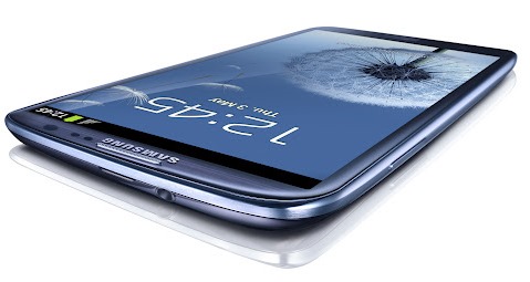
Since its unveiling some two days ago, the Samsung Galaxy S III has become a huge divider of opinion, and while it’s inarguably a powerhouse in terms of hardware, one view seems to be shared universally – it’s not particularly nice to look at.
Being the techies that we are, we’ve focused a lot more on the quad-core processor and 1GB of memory – as well as the key software features – as opposed to whether it sets a precedent for design innovation and finesse. But, in a nutshell, it doesn’t; and if you were to place it next to its predecessor – the Galaxy S II – you would have to say Samsung has taken a step backwards in terms of design.
Which then begs the question, how did Samsung’s design team ever decide this fairly ugly smartphone would take pride of place as the most eagerly-anticipated Android smartphone of the year? Simply put, the answer to that question is: they didn’t.
Believe it or not, the Samsung Galaxy S III was designed by its lawyers. That’s right, the legal team designed the smartphone! The white flag-bearing Samsung legal team – apparently exhausted from fighting rivals Apple in nearly every country on patent issues – designed every single aspect of the smartphone to the book, as not to arouse the attention of Apple’s legal team. The Samsung Galaxy S III has been built so as not to get Apple’s backs up, and by also managing to make the device as ugly as sin, it’s certainly a win-win situation for Tim Cook’s company.
Then again, seeing as 25% of some iPhones are made up of Samsung-purchased components, it’s certainly in Samsung’s best interest to keep the iPhone vs. Galaxy battle ensuing, so one could argue it’s also a win on both sides for the Korean company, too.
Nevertheless, designing a pivotal smartphone to appease another company seems like a rather weak move, and although it hasn’t been explicitly stated by Samsung as designed by lawyers (can you imagine..?), there are plenty of clues, as pointed out, in part, by the AndroidPolice.
The original Galaxy S bore the brunt of much flak for looking a dead ringer of the iPhone 3GS, but that rectangular product shape Apple stakes a claim to is gone, and, under scrutiny, the curves of the Samsung Galaxy S III are so exaggerated that, for the bottom two corners, the curving process begins almost halfway down the device.
With Apple’s ownership of the rectangle no longer threatening, Samsung’s lawyers can also rest assured that Apple’s "rights" over the color black are not going to come back to haunt them. The S III comes in white and dark blue, and although nearly every other device on the market comes in black, perhaps by offering its darker device in blue instead, Samsung feels Apple will stay off its case.
Apple claims the uniform gap between top and bottom borders is a unique idea, thus the top bezel is about 16% smaller than the bottom on the Samsung Galaxy S III. It doesn’t stop there. In April of 2011, one of Apple’s trade dress infringement claims against Samsung was "a display of a grid of colorful square icons with uniformly rounded corners," – which was stopped with the Galaxy S II – has also carried on with the S III.
In fact, the only real similarity between the Samsung Galaxy S III is the metallic band around the edge, and although it seems an isolated incident, will that stop Apple’s lawyers chasing?
Apple’s oft bullish and obnoxious claims of infringement are one thing, but Samsung playing into their hands in this way is a trend that can only get worse as time presses on.
Thoughts?
You can follow us on Twitter, add us to your circle on Google+ or like our Facebook page to keep yourself updated on all the latest from Microsoft, Google, Apple and the Web.

