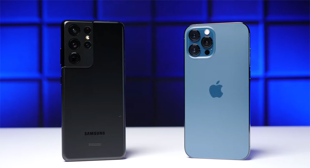
When Apple announced iOS 15 earlier this year and released it in September, one thing that people immediately either liked or hated was the decision to move Safari’s address bar to the bottom of the screen.
It turns out that Samsung was very much part of the former group, going so far as to copy the idea for itself.

Now, Samsung appears to have pushed a web browser update out to its Android phones that gives users the option to put the address bar at the bottom of the screen, just like Safari.
While Apple wasn’t the first one to make this move, Samsung’s timing is certainly suspect. Microsoft did something similar many years ago and other web browsers have dabbled with it, too.
Just like Apple, Samsung does give users the chance to move back to having the address bar at the top of the screen, giving them the flexibility to have it wherever they prefer. We’re still not sure which side we fall on, although there is no doubt that the bottom of the screen is more reachable than the top.
https://twitter.com/dcseifert/status/1455711773802258437
The real issue is years of muscle memory that needs to be overcome — but that’s surely something people will re-learn the more they use the new Safari and Samsung browser.
Apple made changes to Safari across the Mac and iPad as well, undoing many of them as developers and beta testers reported back on them.
You may also like to check out:
- Download Windows 11 Pro ISO File Without Product Key From Microsoft
- Force Download Windows 11 Free Upgrade Right Now, Here’s How [Tutorial]
- How To Install Windows 11 On A Mac Using Boot Camp Today
- Download Windows 11 Installation Assistant For Your PC
- How To Upgrade To Windows 11 From Windows 10 For Free
- How To Create Bootable Windows 11 USB Flash Drive [Guide]
- Download: iOS 15.1 Final IPSW Links, OTA Profile File Along With iPadOS 15.1 Out Now
- Jailbreak iOS 15.1 On iPhone And iPad Status Update
- How To Install macOS 12 Monterey Hackintosh On PC [Guide]
- Best iPhone 13, 13 Pro Tempered Glass Screen Protectors Available Today [List]
- Best iPhone 13, Pro Max 20W USB-C Chargers [List]
- Top iPhone 13 Pro Max Screen Protectors Available To Buy [List]
- Best iPhone 13 / Pro Cases For Protection Available Right Now
- How To Fix Bad iOS 15 Battery Life Drain [Guide]
- Apple Watch ECG App Hack: Enable Outside US In Unsupported Country On Series 5 & 4 Without Jailbreak
You can follow us on Twitter, or Instagram, and even like our Facebook page to keep yourself updated on all the latest from Microsoft, Google, Apple, and the Web.

