iOS 10 review: Apple’s release of iOS 10 is one that is neither a maintenance release nor one with huge changes that will get even the most jaded of iPhone owners excited. It sits somewhere between those two extremes, adding security updates, bug fixes and tweaks whilst also making room for some pretty radical changes to the way we will use our iPhones and iPads post-iOS 10. In an age where Apple receives – justifiably, in our opinion – plenty of flak for shipping sub-par software, iOS 10 looks and feels like a release that has taken some of that on board, but it’s far from perfect.
I’ve been using iOS 10 since the initial beta release all the way through to today, and now that iOS 10 is a thing that everyone with a compatible iPhone or iPad can try out, I’m pleased to now be able to see what everyone else thinks about the release. But before then, let me tell you a little bit about iOS 10, and why it’s good and bad in equal measure.
iOS 10 – Can You Install It?
For those who are wondering whether they will be able to get iOS 10 installed on their devices, the chances are that the answer will be a yes. With Apple offering the update, as always, to anyone who wants it for free, the only downside here is that you’ll need to have at least an iPhone 5 or newer or an iPad mini 2/iPad 4 or newer in order to install it. That means that while there will be some that can’t take advantage of iOS 10, the vast majority will – and if you can’t, then now might be a good time to upgrade your hardware to something a little more recent. You’ll see the benefit, that’s for sure.
To check if your device is compatible with iOS 10, head on over to our compatibility guide here: iOS 10 Compatibility For iPhone, iPad, iPod touch Devices.
Don’t Slide To Unlock (Lock Screen)
If you’ve used an iPhone, or probably any other smartphone over the last ten years, then the chances are huge that you have become very, very familiar with the concept of sliding your finger across a screen in order to unlock a device, whether that’s a smartphone or a tablet. Apple, in particular, has used the “Slide to Unlock” system for unlocking iOS devices since day one back in 2007, and it’s second nature to most of us. Unfortunately, Apple isn’t one for keeping things around because we’re familiar with them, even if sometimes, it seems to change things for the sake of changing them.
With iOS 10 installed, unlocking a device is a case of pressing the Home button to wake the screen, and then pressing it again to unlock. It’s at this point that Touch ID kicks in or, if so configured, the user is prompted for a PIN or password. (also read: Disable iOS 10 Press Home To Unlock / Open On Lock Screen, Here’s How)

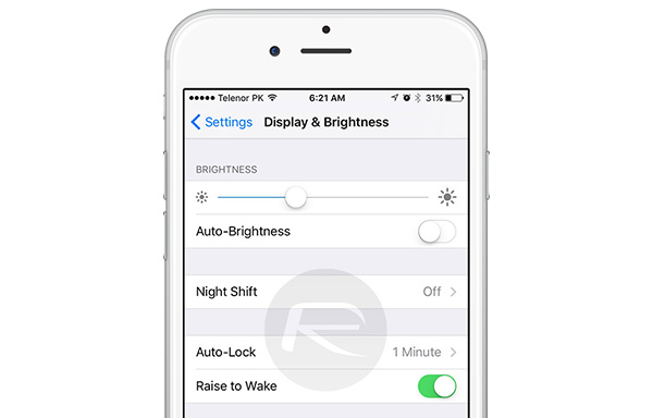
There’s a new Raise to Wake feature that wakes the screen as soon as you lift your device, though it is only compatible with select devices capable of running iOS 10, at least for now.
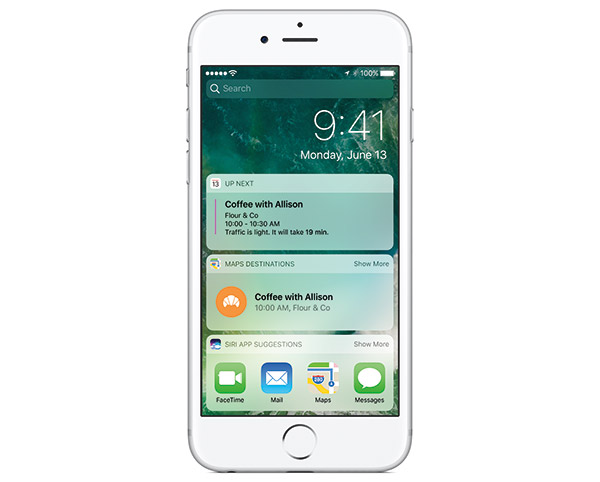
Swiping no longer unlocks anything. In fact, it now invokes a screen that shows all active widgets. This means widgets are now much more center-stage than before, and if you’re anything like me, you will find yourself staring at them far too much, but only because you forgot and, you guessed it, tried to swipe to unlock. A swipe in the opposite direction kicks the camera into gear, even though with previous releases of iOS, the camera was just a vertical swipe away on the Lock screen anyway. Why change it in this way, Apple. Why?
Control Center, Notifications, Home, 3D Touch Integration, More
Speaking of swipes, swiping up from the bottom screen gives us Control Center, and while it’s had a cosmetic redesign, the thing works pretty much identically to Control Center in iOS, but the layout has been tinkered with. After months of testing, I still find it difficult to have any strong thoughts on Control Center, which probably says a lot about the feature.
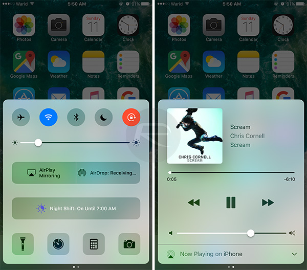
Control Center has three different panes now, one for the usual toggles, second one is dedicated for Music and third one is for home automation if you have iOS 10 Home app (more on that later) configured for use with HomeKit devices. Control Center now also has colored toggles at the top, with 3D Touch Quick Actions available on a number options such as flash light, clock, camera etc.
Notification Center is still around, of course, and those with 3D Touch-enabled devices can now press harder on a little cross to delete all notifications at once. Finally.
As for the notifications themselves, they’ve received a cosmetic and functional redesign, with the Quick Reply feature becoming more interactive, letting you view an entire Messages thread right from within the notification when a 3D Touch action is invoked on it, for instance.
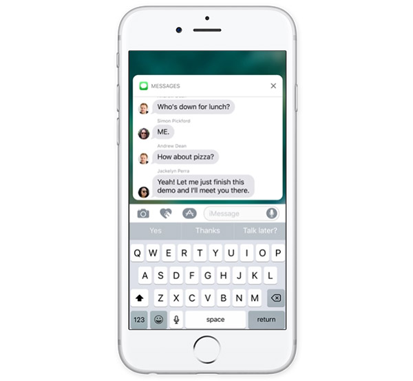
The Home screen remains unchanged for those with older devices. For the 3D Touch-enabled, though, there’s a fancy new addition that displays interactive widgets for apps (in both first and third-party) when their icons are hard-pressed. With new, faster hardware on the way, it was only a matter of time until more power was added to 3D Touch interactions.
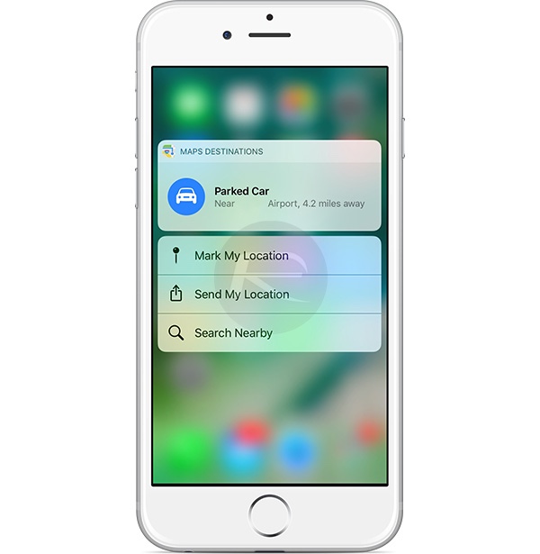
iOS 10 Home screen widgets: And yes. Part of new Maps and CarPlay experience, you now get location of where you last parked your car as soon as you disconnect your iPhone from car’s Bluetooth or CarPlay-enabled stereo.
As mentioned earlier, another area with new, and perhaps more practical, 3D Touch Quick Actions is the Control Center’s system toggles, some of which can now be hard-pressed for a pop-up containing additional options.
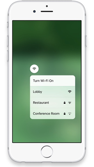
With iOS 10, Apple has really made 3D Touch an integral part of the experience. While most (not all) of the 3D Touch functionality is available on non-3D Touch devices too via a long tap, but to fully experience iOS 10, a 3D Touch device is now a must-have.
Message Received (Messages App)
Apple’s Messages app is apparently the most popular app on the platform, which means fiddling with it is a risky business for Apple. Get it wrong, and a lot of people will notice. Get it right, however, and those same people will be left in a much more friendly state of mind. With iOS 10’s updated Messages app, Apple may have gotten it right this time around.
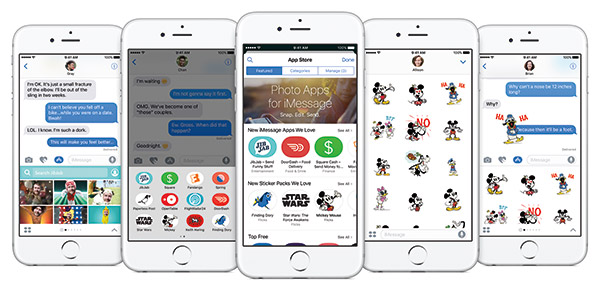
Digital Touch has now made the migration from Apple Watch to iOS, allowing users to sketch drawings and send taps or even heartbeats to their friends.
Sketching, in particular, can be useful within Messages, especially when you factor in that sketches can be made on top of images, making it possible to mark up images and send them on their way. That’s super useful if you find yourself having to send screenshots with notes, or want to draw an arrow on a map, for example.
The revamped app also lets you send handwritten messages after switching to landscape orientation on an iPhone, or via a dedicated button on iPad, complete with the option to select from a recent history of past handwritten messages.
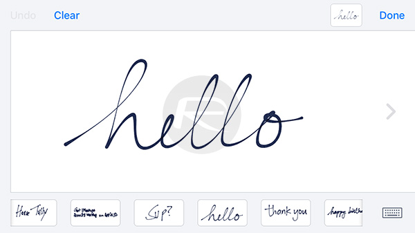
Fans of Emoji will be pleased to learn that super-sized emoji can be sent, and if you’re more old school, then you can write on your iPhone or iPad’s screen instead. Things like this are wonderful, but they may pale into insignificance alongside tapbacks/reactions and effects with time.
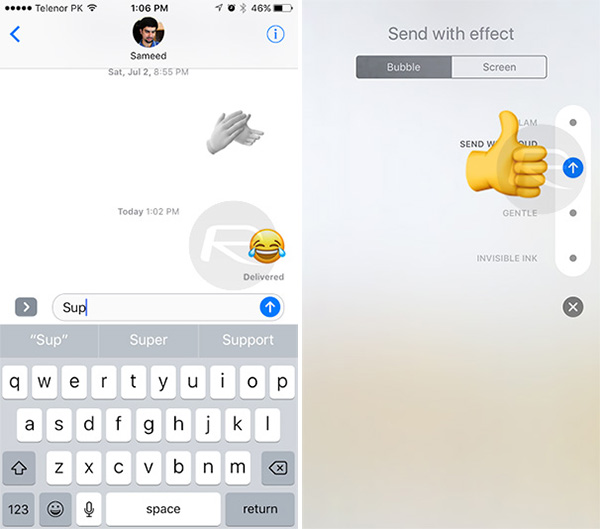
Using effects, users can have iMessages essentially animate, with the ability to fill the screen with balloons, for example, or maybe have text float gently onto the screen. Furthermore, third-party iMessage apps can be installed, which further change how Messages looks, and indeed, works.
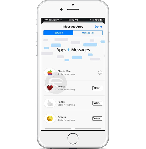
There are stickers to be shared and apps that make it easier to collaborate on something, all right from within the Messages app. It’s a platform in its own right, and one that will live or die by the support that developers either do, or do not show for it. It’s still very early days, but I think the chance to sell stickers to users will prove too tempting for many.
Messages is now very much more than just a way to send a text message.
Picture This (Photos App)
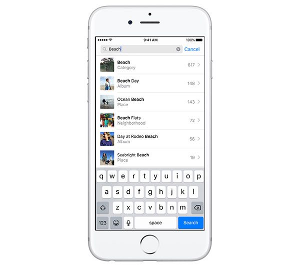
Apple’s Photos app has not been forgotten as part of iOS 10’s revamp, either. Similar to how iPhoto did on the Mac years ago, Photos on iOS can now look at all images and then recognize faces and objects within them. Now you’ll be able to choose to only see photos with your best friend in them, or one with your kids, or dogs, or car, for that matter. Pretty nifty, and it’s all done on-device too, so no images have to be sent off to Apple’s servers to be worked on. It’s called Differential Privacy and Apple is pretty proud of it. That’s also where all that horsepower comes in useful on a modern iOS device.
The new Memories feature takes images and mixes them with music, titles and transitions to create a little presentation of sorts. It’s cute, but I doubt whether anyone will really take advantage of it beyond the initial curiosity of such a thing.

You Have Reached Your Destination (Maps App)
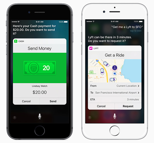
It may arguably still be lagging behind Google Maps, but Apple Maps has improved by leaps and bounds over the recent years, and with iOS 10, it’s better than ever. Maps now features third-party app integration, meaning that booking that restaurant table, or ordering a taxi might not be a case of jumping around from app to app but instead would all be handled via just the one.

A More Useful Assistant (Siri)
Speaking of app integration, Siri is getting in on the action too. Finally, Siri will be able to talk to third-party apps, meaning we as users can in turn talk to them without having to resort to tapping away at them like animals. I am still very lukewarm on Siri as a concept, but integration with our favorite apps may help with that.
Easy Listening (Music App)
Apple Music has received quite the revamp, doing away with some of the confusing navigation of the original app and instead replacing it with another confusing interface. Now, granted, it’s confusing for different reasons, but at least it’s something new to be exasperated with.
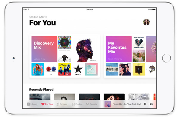
The Connect feature within Apple Music has now disappeared from view, thankfully, and playlists have received a lick of paint, though I still find myself tapping around Apple Music in the hope that whatever I want to accomplish will happen via potluck and serendipity, rather than our ability to traverse the app with any sort of purpose. Apple Music was one of Apple’s weaker app implementations before iOS 10, and that hasn’t changed after it either.

Apple News & Notes Apps
Music app isn’t the only one that has received a revamp. Perhaps feeling a little left out, Apple News app has gotten itself a little makeover too with support for notifications, widget, and more.
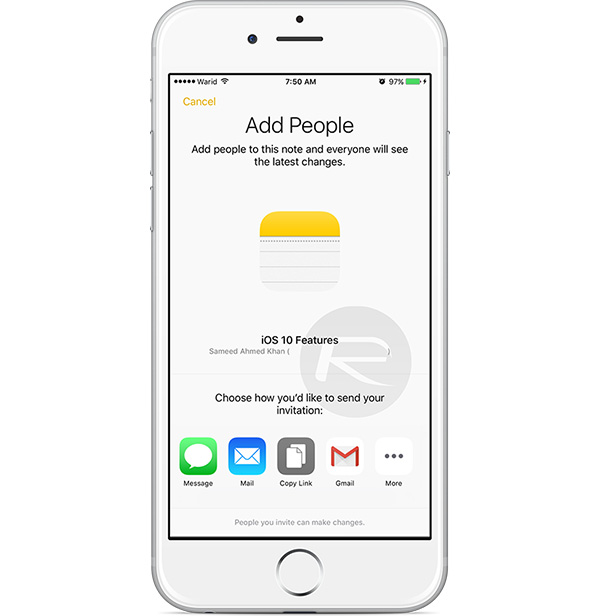
The stock Notes app has actually added a new feature to its repertoire, now allowing users to share and collaborate notes with each other.
Connected Home (Home App For HomeKit Accessories)
Home automation enthusiasts will be happy to know that Apple’s own HomeKit platform has been wrapped up into an app and included in this latest update. The new Home app should help you manage all your connected devices easily, in groups, if the need arises, and more importantly, from one place.
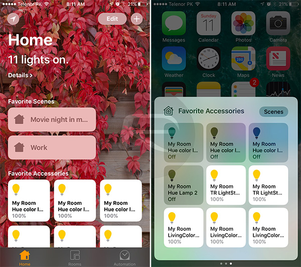
There were third-party solutions before, but a clean, official solution is something that has been on the HomeKit user’s wishlist for quite some time, and iOS 10 finally delivers, with the added bonus of the iPad now able to act as a HomeKit Hub.
You can find a list of our favorite HomeKit compatible accessories here: The Best Apple HomeKit Siri-Enabled Devices And Accessories.
Moving Swiftly (Swift Playgrounds App)
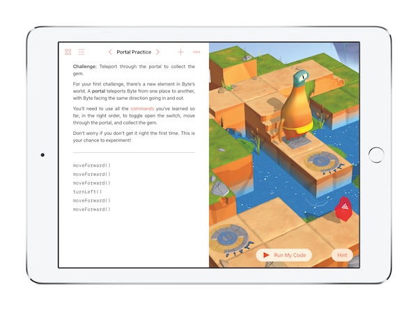
Apple may not have brought Xcode to the iPad as many have been hoping for, but it has taken a step in the right direction with Swift Playgrounds. Aimed at kids more than any other demographic, the app aims to teach people how to write code, in Swift, obviously enough, and make on-screen characters perform actions. It’s not Xcode by any stretch of the imagination, but it’s essentially programming on an iPad, so that’s a start at least.
iPad Features?
As for the iPad in general, iOS 10 does little to give the tablet a push at a time where it is starting to stagnate once again. Beyond Swift Playgrounds, there’s Safari’s ability to go into split-view on its own to allow side-by-side browsing of the web, but iOS 10 isn’t one for iPad lovers. The tablets do get the same additions as the iPhone, but it doesn’t get a great deal that’s iPad-specific, which is a real shame because iOS 9 did brought many iPad-only features.
Snap, Snap, Snapping (Camera App)
Apple’s iPhone is a hugely popular camera, and with iOS 10, the camera app has received some love, so long as you’re carrying an iPhone 7 Plus. If that’s the case, then there’s a new 2x button that, when you tap it, switches the view to an optical zoom, and an on-screen wheel that can be thumbed through to increase the zoom up to 10x via software.

There is also the depth-of-field software magic that goes on when using the iPhone 7 Plus and its dual-lens camera system, but that will be coming in an update to iOS 10 later this fall, we are told.

In Conclusion
Our video of iOS 10 features when it was initially announced back at WWDC 2016.
Subscribe to our YouTube channel for more videos.
With iOS 10, Apple hasn’t gotten a whole lot wrong, per se. I’m not a huge fan of the decision to kill the “Slide to Unlock” gesture, though that may just be a case of needing to re-learn some habits. That being said, I’ve not managed it yet and I’ve gone through eight beta releases. It will be interesting to see how well that idea of pressing the Home button to unlock instead will stand up to the new Home button on the iPhone 7 and iPhone 7 Plus, seeing as it isn’t really a button at all. Time will tell.
Apple has added some interesting new features to apps like Messages, but I suspect that those will either be features for people younger than I, or ones that will be used a few times and then forgotten about, like so many in the past. After all, does anyone still send people their heartbeat from their Apple Watch? It’s possible I’m simply not the target audience here, though, and that’s fine. I should be, though – mid-thirties, willing to spend money on technology and in a country full of Apple Stores. Maybe I’m just missing the point.
Having lived with iOS 10, I’m struggling to find anything that would stop me in my tracks should I downgrade to iOS 9, and that’s disappointing. I know some reviews on the internet right now will wax lyrical about how Apple is taking mobile operating systems to the next level with iOS 10, how it has made the best smartphones even better, how it’s going to change the way you work and play. I’m going to tell you that very little of that is accurate, to my eyes, and that iOS 10 represents a missed opportunity to bring something to the tablet akin to OS X – a massive departure from what we knew. Or just something… new.
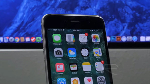
Instead, iOS 10 is very familiar except in ways that irritate. We can all agree that the iOS Lock screen needs work, and that notifications don’t quite hit the mark. The problem is that none of the changes made as part of iOS 10 really rectify all that. This is still iOS 9, but altered in some ways that will have you wondering whether some engineers within the iOS team could have perhaps been better utilized elsewhere.
Hey ho. There’s always iOS 11.
You may also like to check out:
- CarPlay Features In iOS 10: Here’s What Is New
- How To Downgrade iOS 10 To iOS 9.x [Tutorial]
- Jailbreak iOS 10 / 10.0.1 For iPhone, iPad, iPod touch [Latest Status Update]
- Download iOS 10 / 10.0.1 Links & Install On iPhone 6s, 6, Plus, SE, 5s, 5c, 5, iPad, iPod [Tutorial]
You can follow us on Twitter, add us to your circle on Google+ or like our Facebook page to keep yourself updated on all the latest from Microsoft, Google, Apple and the Web.

