When I jumped onto the iOS bandwagon a couple of months ago, I was unanimously directed towards Reeder when I asked fellow enthusiasts for the best RSS reader on the platform. Being the news junkie that I am, Reeder was the first app I bought as soon as I set up my App Store account. I fell in love in the app at first sight! It’s user-experience is absolutely fantastic! So fantastic, as a matter of fact, that I now prefer going through my RSS feeds on the iPhone with Reeder than on my desktop computer with Google Reader.
Now, the developers have released a major new update. Reeder 3.0 is a completely new, written-from-the-ground-up version of the popular RSS reading app. It brings a number of amazing new features to the table, all of which help enhance the already excellent news-reading experience that was offered by Reeder 2.x.
We’ve discussed – in detail – all of these new features in the form of an app review. Check it out after the jump.

Multiple Account Support For Fever and Google Reader
The biggest new feature in Reeder 3.0 is multiple account support for not just the accepted standard in RSS subscription management – Google Reader – but also for an emerging alternative service called Fever which uses intelligent techniques to present the hottest news and more interesting articles to you.

Multiple-account support is visible right at launch when the app asks you add your Reader/Fever/Readability accounts.
I personally just use one Google Reader account so this isn’t much of a big feature for me, but for those of you who have separate Reader accounts for, say, work and home, then this will be very, very useful.
Subscribe / Unsubscribe Reader RSS Feeds
Previously, Reeder only downloaded RSS feed items by syncing with your Google Reader account. Now, it allows you to add new subscriptions, edit and unsubscribe from already included ones. Because of this enhanced functionality, users have to give access to Reeder 3.0 separately: your own logins won’t work.
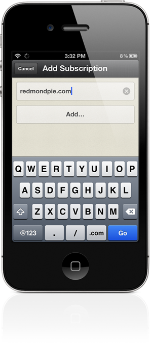
This was one of my biggest gripes with Reeder 2.x as I unsubscribe from low quality blogs / news sources very regularly with fresh new RSS feeds to replace them. Previously, I would have to login to Reader to make these changes, but now I can do them without ever leaving Reeder. Splendid!
Better Reading Options (Text Size / Line Height)
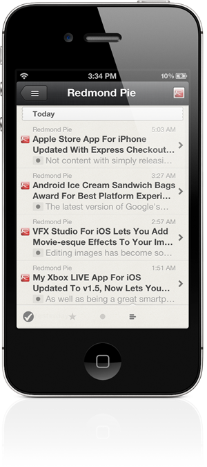
Those of you with poor vision or just a penchant for bigger text sizes, like yours truly, will absolutely love the option to change text size and space between lines in Reeder 3.0. All it takes to access this is the aA button in the top right corner when viewing a news item.
Deeper Integration with Readability
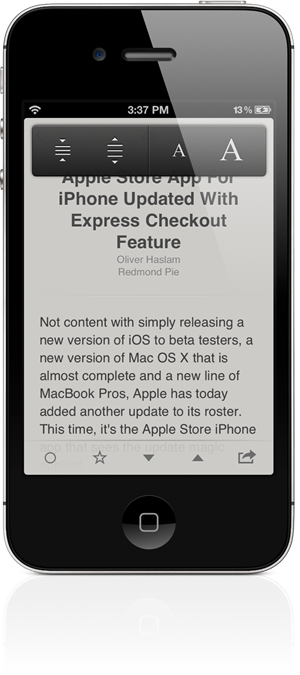
Readability is the most controversial read-it-later service because of the subscription fiasco. That issue has dumbed down now, after Readability agreed to stop charging money for other people’s content and giving away previously earned money to charity. The service seems to be a favorite among Reeder’s developers as it was given preference in Reeder 2.x and now in 3.0, there is even more evidence of that: all articles are now loaded in Readability mode.
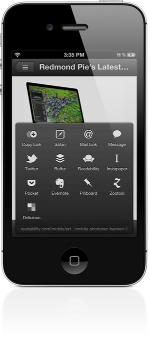
This actually isn’t a bad thing at all because of one important bit: truncated posts can now be read inside Reeder with a simple pinch-to-zoom gesture which downloads the entire article in Readability mode. I wish there were a way to enable full-article view by default, but I guess that wouldn’t fit well with blogs which get their revenue from ad impressions.
Improved User Experience: Smoother UI, More Gestures
Let’s now discuss the myriad of user-interface tweaks in Reeder 3.0. The old book-with-a-star icon has been replaced with a star. The app no longer takes over the screen when syncing with your RSS feed. The updated design now lets you focus on the article itself: gone are the distracting black navigation and sharing bars (replaced with sepia-colored floating ones).
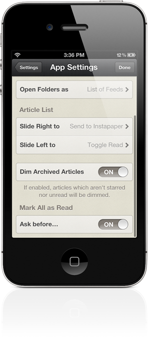
There is a stronger focus on gestures. Users can perform a two-finger swipe up/down to mark items above/below as read instead of tapping the <tick> button to mark all as read; users have more control this way. You can now pinch-to-zoom images, swipe to the right in article view to go back to list of articles, swipe left to open the article in the in-app browser and, as mentioned previously, pinch to enable full-article view in Readability.

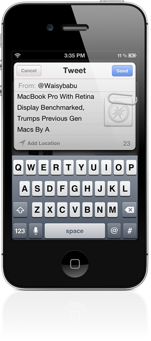
Sharing articles has also been enhanced. Two new services have been added – Buffer and QUOTE.fm – while Facebook sharing has been removed (this will be added later). The sharing menu itself now pops-up instead of sliding up and is, according to some, more useable. Me? I don’t see much of a difference. Nothing wrong with this, though: if it ain’t broke, don’t fix it!
Last but not least, all app settings have been moved to within the app itself. No need for going into Settings.app to change small options!
Conclusion
I’ll keep it short and to the point: Reeder 3.0 is simply the best RSS reader on the iPhone. The user-experience enhancements in 3.0 – multiple account support, deeper Readability integration, intuitive swiping gestures, article view options – make it a must-have app for news junkies. 10/10. Would buy again!
Download Reeder for iPhone [iTunes link]
Be sure to check out our iPhone Apps Gallery and iPad Apps Gallery to explore more apps for your iPhone, iPad and iPod touch.
You can follow us on Twitter, add us to your circle on Google+ or like our Facebook page to keep yourself updated on all the latest from Microsoft, Google, Apple and the web.

