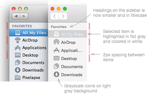
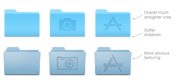
Apple just announced and released the Developer Preview of OS X 10.10 Yosemite, and although the forthcoming Mac software update offers a little more than a few cosmetic changes, it is indeed those aesthetic tweaks that are most noticeable about this particular version. Here, we take a look at Yosemite’s UI elements versus the corresponding design of the preceding OS X 10.9 Mavericks, and although it doesn’t, on the whole, feel as dramatic a departure from tradition as iOS 7 did back in September of last year, the breakdown really hits home how much work Apple’s design team has put in.
After the disastrous release of iOS 6, which caught the headlines mainly due to the shortcomings of Apple’s in-house Maps offering, the Cupertino parted ways with Scott Forstall, who was not only the senior vice president of iOS software at the time, but was said to be the Apple executive most like the late Steve Jobs. As a consequence of Forstall’s departure, Apple and Jony Ive, who was the lead hardware designer at the time, sought about changing the appearance of the software line-up, and in turn, declared an all-out war on skeuomorphic elements.
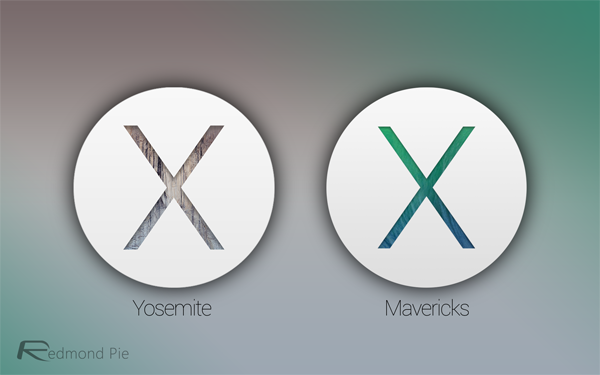
The result, as seen with iOS 7 and now OS X 10.10 Yosemite, is a flatter, cleaner, and arguably better overall look, and as you’ll see in some of these side-by-side graphics, the difference between Yosemite and Mavericks is stark.
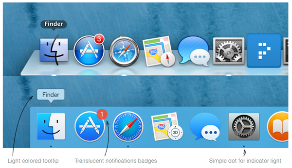
The dock, which has been a mainstay in the OS X ecosystem for a very long time, no longer sports that trademark, frosted glass shelf, but instead, offers a light blue background that also does away with those polarizing reflections.
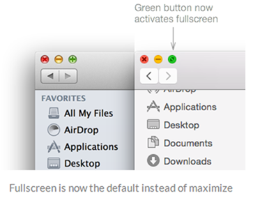
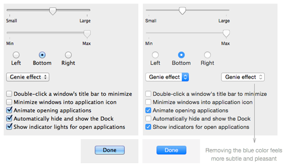
As pointed out by the folks at Pixelapse, even the top bar has been offered some tweaking, and although some of the changes mightn’t be immediately noticeable to those switching from Mavericks, Mountain Lion or any other fairly recent flavor of OS X, Apple has paid typically close attention to detail in almost every department here.
Given how the reach of OS X is nowhere near that of iOS and that we’d already had the shock value of iOS 7’s dramatic makeover, there hasn’t been as much of a reaction to Yosemite, although most commentators seem united in pushing the notion that this is a progressive move from Apple.

What do you make of Yosemite’s UI – is it an improvement on Mavericks?
(Source: Pixelapse)
You may also like to check out:
- Download OS X 10.10 Yosemite Developer Preview 1
- Mac OS X 10.10 Yosemite Announced: Features And Everything You Need To Know
You can follow us on Twitter, add us to your circle on Google+ or like our Facebook page to keep yourself updated on all the latest from Microsoft, Google, Apple and the Web.

