Although we are only three months into the life of the current model, speculation is starting to come thick and fast about the possible design, aesthetics and specification of the next-generation iPhone from Apple. With the launch of the original iPhone in 2007, we witnessed a beautiful blend of form and functionality, with consumers delighted by the large, capacitive touch screen display.

The subsequent releases of the iPhone 3G and 3GS followed the same basic form of the original iPhone, but featured a new black plastic surrounding and casing. It wasn’t until the iPhone 4; which was released in June 2010 when we saw the company taking a new direction, releasing a fully redesigned device.
Both the iPhone 4 and 4S have the same physical design, featuring toughened glass on the front and rear with an oleophobic coating to eradicate those smudges. A stainless steel band surrounds the beautiful glass enclosure which is more than just aesthetic; as it acts as an antenna for Wi-Fi and cellular network data.
The interest which surrounds the launch of any new Apple device – especially the iPhone – is always immense with news sites around the world trying to speculate and guess just what the new gadget will look like. We are generally treated to an employee or test engineer leaving a device in a bar somewhere just before launch which gives us some indication about the phone itself, but until that keynote speech; we can never really be sure about the final product.
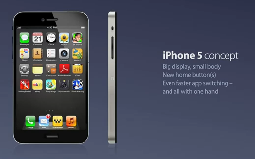
To pass the time until launch, we can always rely on various designers and enthusiasts releasing their own unique mock up concepts of what they think would make a saleable device. We have previously reported on a concept design by ADR Studios, but now is the turn of designer Kris Groen who has released his own concept design.
Groen has re-imagined the iPhone by totally removing the Home button, which has been a consistent feature since 2007. The button which we all known has now been replaced with two separate Home buttons on each side of the handset, located mid way up. From a user experience point of view, Groen believes that ‘squeezing’ both of the new Home buttons together would take you directly back to your Springboard.
The first thing you will probably have noticed is the screen size, which has been increased to a whopping 4-inches diagonally with the beautiful Retina display. The Home buttons which are located on each side of the device would also allow for fast app switching when used individually.
Check out the video below and see what you think.
(via AppAdvice)
You can follow us on Twitter, add us to your circle on Google+ or like our Facebook page to keep yourself updated on all the latest from Microsoft, Google, Apple and the web.

