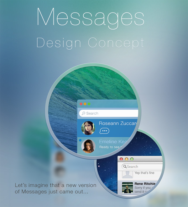
Apple’s decision to revamp and revitalize the rather disheveled iChat app was undoubtedly a decision that was needed to be made, but the execution of that decision has left more than a lot to be desired. OS X users have been more than happy to let Apple know that the Messages app on their platform isn’t up to scratch, but while we wait for the Cupertino overlords to do something about it let’s take a look at a new Messages concept that totally overhauls the app with the aim of actually appealing to those who use the service.
The transition from iChat to Messages was a process that sparked a lot of enthusiasm from the OS X community. Keeping the current instant messaging platform and integrating their own iMessage protocol meant that Apple was not only extending the functionality of an existing piece of software, but also encouraging users to adopt iMessage as their main form of text based contact. Developer Dennis Pakhaliuk has taken matters into his own hands by re-imagining the Messages app with a design that sees the user-interface stripped away and focus placed very much on the actual content of conversation.
Regardless of if you believe content is king and the design should be an afterthought, or if you sit on the other side of the fence and think design can make or break an app, the first thing that grabs your attention with any Mac is the overall aesthetics. Pakhaliuk has redesigned the main Messages user-interface to benefit from what he calls "smart colors" and to implement a translucency effect that immediately makes you think of the new iOS 7 blur effects which Apple used so eagerly throughout their mobile operating system.
In addition to providing an aesthetic overhaul the new concept also focuses on the features that are important to the end-user. A whole host of new status indicators have been added as well as extended support for uploading and downloading various media types. The real power of this concept comes from the integration of true synchronization functionality that would essentially eradicate most of the current issues that users face when using Messages between OS X and iOS. The full image gallery shows exactly what the designer has in store for Messages so check it out and see what you think.
(Source: Behance)
You can follow us on Twitter, add us to your circle on Google+ or like our Facebook page to keep yourself updated on all the latest from Microsoft, Google, Apple and the web.

