iOS 7 may have already made its ceremonious entry into the market, and save a couple of complaints about vertigo and motion sickness thanks to the new animations, the vast majority of consumers have adapted well to the new software.
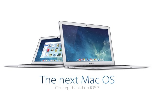
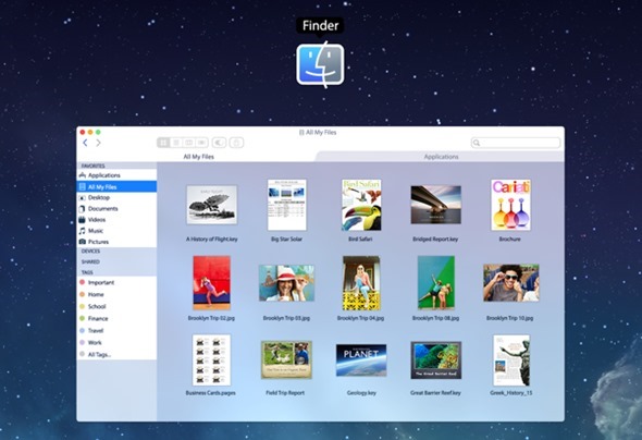
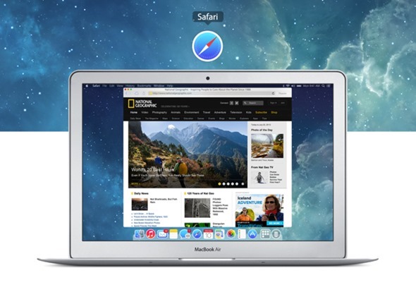
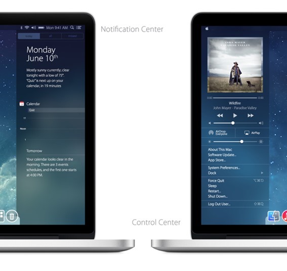
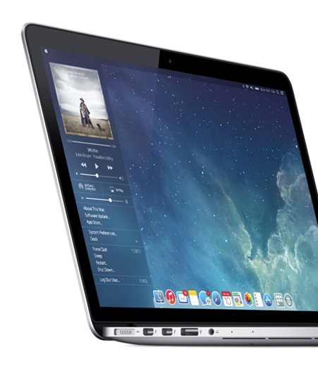
With the latest and greatest version of the mobile OS now out in the wild, we’re currently waiting on OS X to make its grand entrance, and having first been revealed at this year’s WWDC, we’re eager to see how the new features – as well as the to-be-expected surprises – combine to form the first of the post-big cat releases. Below is a concept which, like some we’ve seen before, borrows design cues from the flatter, brighter, iOS 7, and although we were impressed by the previous iOS 7 inspired OS X concept, the subtlety and simplicity of this one makes it even more of a winner.

The last iOS 7-ified concept we featured was rather drastic, with some of the designs and navigation panes looking as though they’d been pulled straight from Microsoft’s Windows or Google’s Chrome OS. But this new one, which we’re presenting you today, dreamed up by designer Edgar Rios, looks very much like the OS X we know and love while also doing away with the many skeuomorphic elements Apple appears to be clamping down on.
When WWDC came around and iOS 7 was revealed, there was a bit of an outcry from a large faction of Apple fans, many of whom were dismayed by the decision to change the look so severely. But with tens of millions having installed it on their iPhone, iPad and iPod touch devices over the past fortnight, complaints regarding the new aesthetic have been very few and far between.
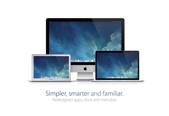
We’ve see nothing to suggest that OS X Mavericks will release with a design overhaul, but over the course of the next year, it would seem something of a formality that the desktop operating system will see uniformity with iOS 7 and beyond.
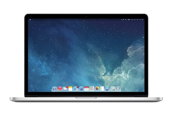
If you’ve seen and digested the above concept in its entirety, then be sure to let us know what you think of it by leaving your thoughts and comments via the usual channels. More importantly, would you be happy if Mavericks did look like this?
(Source: Behance)
You can follow us on Twitter, add us to your circle on Google+ or like our Facebook page to keep yourself updated on all the latest from Microsoft, Google, Apple and the Web.

