Not so long ago, the iPod range was the focal point of Apple’s product roster, but with the increase in popularity of both the iPhone and more recently, the iPad, has seen the once-popular music player slip into near obscurity.
Even the iPod touch – Apple’s only App Store-compliant iPod – appears to have seen better days, and in what is extremely rare coverage of any Apple product other than the two main iDevices and the MacBook range, Japanese blog Macotakara has reported that Apple is to redesign the iPod nano later on this year with a couple of pretty significant changes.

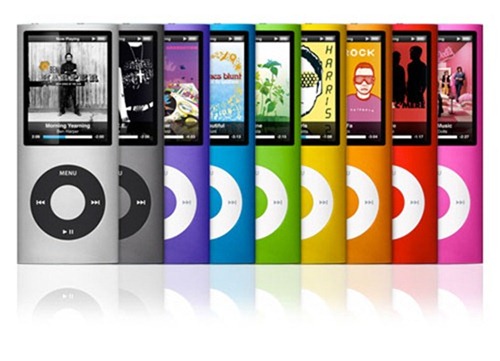
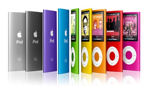
The device will apparently ditch the small, watch-sized form factor in favor of a more oblong structure, which is said to be more in the image of the iPod touch. Although, to me, it looks a little more like an old-school iPod nano than an iPod touch, it could also feature a home button, which would certainly drag it closer to the newer devices to have been released by the Cupertino outfit.
Despite the home button, the minute screen will probably mean it won’t run the usual iOS apps, although there could certainly be scope for a segment of the famous App Store to be dedicated to the new device. This notion is corroborated by Macotakara, which states Apple will be bringing a "dedicated new iTunes service" of some description for the device, but at this point in time, there are no further details as to what this means.
If there was to be substantial App Store support, this could spell further trouble for the iPod touch. Of course, browsing and using certain apps wouldn’t be quite the same, but with a 7.85-inch iPad heavily-rumored to be arriving in the coming months, there may not be much space left in the market for so many devices to command strong sales.

Apple usually sticks to its ethos of making devices smaller and lighter with each new iteration, but with the current version scarcely larger than a square inch, it could be time for a re-think.
I always preferred the larger nano, and if Apple did completely re-vamp the music player in favor of the depicted design, I would certainly find it a great deal more appealing.
Thoughts?
You may also like to check out:
You can follow us on Twitter, add us to your circle on Google+ or like our Facebook page to keep yourself updated on all the latest from Microsoft, Google, Apple and the web.

