The iPhone 6 is coming, and boy do we know about it. We are currently sitting right at the peak of the speculation and concept stage of the annual release cycle, meaning that each day we can look forward to a new influx of best and educated guesses pertaining to potential device specifications as well as new concept art. There will undoubtedly be an exception to that at some point but today is not that day. Following hot on the heels of yesterday’s beautiful iPhone 6 renders from Mark Pelin, we are now seeing a new – albeit very similar – set shown off in multiple colors.
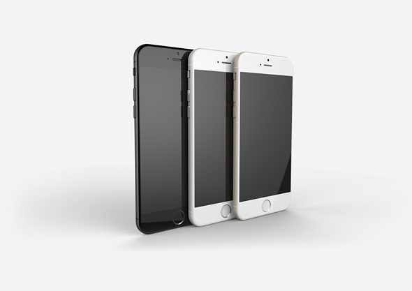
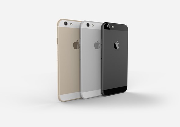
Thomas Moyano and Nicholas Aichino – the two design professionals behind these latest concepts – have based their representation of the device on the latest rumors and leaks that have surfaced on the Web. The iPhone 6 is mocked up and shown in Space Gray, Silver and of course in the beautiful Gold tint that first made an appearance with last year’s launch of the Touch ID capable iPhone 5s. Bringing in a splash of color to each variant of the rumored iPhone 6 isn’t exactly a touch of genius, but it is likely to be accurate given Apple’s recent release history.
The overall form factor of the device is very similar to the majority of concepts that we have seen over the last few weeks. This is almost certainly down to the leaked rear shell component that surfaced on the Web some time ago featuring a new aesthetic with accentuated rounded corners that bleed seamlessly into the front bezel of the hardware. At first glance, the front of the device could be mistaken for the iPhone 5s as it features an almost identical design and set-up with the Touch ID sensor and protruding volume buttons. What is interesting is that the designers in question haven’t mocked up the device in two different sizes.
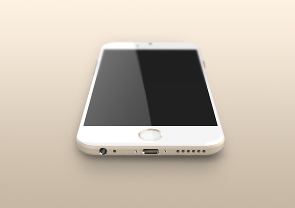
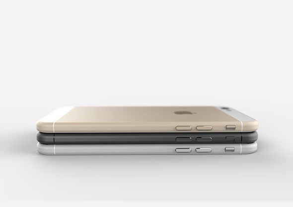
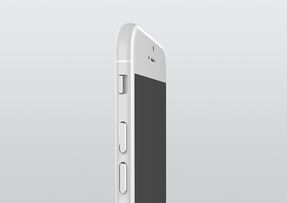
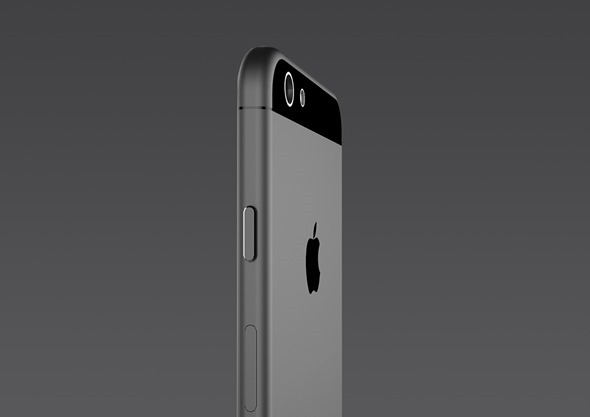
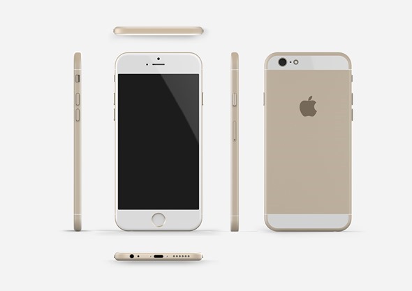
If the design for the bottom of the iPhone 6 proves to be accurate then don’t expect much change from what’s already showcased on the iPhone 5s. The 3.5mm headphone socket is located in a familiar position. As is the Lighting connector dock for charging and syncing the device with iTunes. The main difference here appears to be the relegation of space assigned to the speaker grilles on either side of the Lightning connector.
As we keep pointing out, we won’t know until we know, but at least it’s a little bit of Apple based eye-candy to set the mood for the official announcement.
(Source: Behance)
You may also like to check out:
You can follow us on Twitter, add us to your circle on Google+ or like our Facebook page to keep yourself updated on all the latest from Microsoft, Google, Apple and the web.

