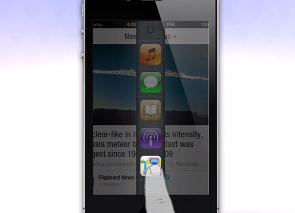
Concept ideas help us to visualize a specific new feature or piece of software or hardware, rather than just imagining, and with the faults of iOS 6 having been well-documented of late, it’s no surprise that we’ve seen a slew of concepts purporting to improve elements of Apple’s mobile OS. One area which has seen a lot of attention – particularly in the jailbreak scene – is the app switcher, and Sentry, the designer behind Auxo tweak, has come through with another alternative take on how the Cupertino company could reinvent the multitasking bar.
There’s little argument that, in its current form, the multitasking bar / app switcher of iOS is next to useless. Functionality is poor, with users requiring a long press before closing apps down one-by-one, and considering some of the free-flowing seamlessness iOS has to offer in other departments, it’s almost inexcusably behind the times.

With Jony Ive said to be at the helm of iOS nowadays, we’re waiting on the release of iOS 7 with bated breath, but it’s hard not to imagine a parallel universe where Apple took on board more of the work of jailbreak developers. For any of you that have used Auxo in the past, you’ll have seen just how far behind the native offering is, and although it’ll likely be a subject of fierce debate, Sentry’s latest concept idea is arguably even better than that.
To bring about this new style of app switching, one simply swipes up from the middle of the display, after which the interface breaks from the center to reveal open apps, akin perhaps to the iPad’s keyboard. From there, one can easily flit between open apps, and by sliding left or right, other settings such as volume, brightness, and toggles similar to SBSettings, are also revealed.
As a long time fan of SBSettings, NCSettings, and other similar tweaks, I would love to see such an implementation brought to the app switcher. The vertical split, to me, is a nice aesthetic touch, but doesn’t add a great deal to the experience that isn’t already there. If we could, perhaps, have the look and functionality of Auxo, with the added toggles included in this particular concept, I think we would be onto a real winner.
What do you think – would you favor this concept to replace the current app switcher? Share your thoughts via the usual mediums below!
You can follow us on Twitter, add us to your circle on Google+ or like our Facebook page to keep yourself updated on all the latest from Microsoft, Google, Apple and the web.

