Whatever eventually happens with regards to the iPhone 6, the so-called "iWatch" and the many other Apple products that are supposedly going to appear later on in the year, the new iOS 8 software will no doubt prove integral. So far, we’ve heard that it will pack Healthbook, an iTunes Radio app, and several other new features as well as improvements to pre-existing services like Maps. If any enhancements are in the offing for Control Center — which, itself, only arrived with September’s iOS 7 — then we certainly hope that they’ll take at least some cues from this concept below.
Control Center was one of the few major new features added to the fold with iOS 7, and given that it was the aesthetic tweaks that made most of the headlines, it seemed to rather sneak in unassumingly. But there’s no doubt that, for the longest time, many iOS users were crying out for some kind of quick-access pane for toggles and such, and while the jailbreak scene had more than tided us over thanks to SBSettings and similar, it was great to see Apple finally offer something natively.

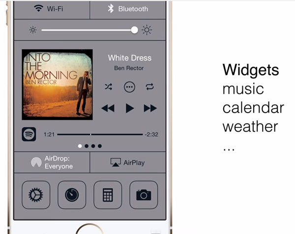
The Control Center has greatly enhanced general functionality and all, but there’s always room for improvement, and concept maker Ryan Gilsdorf has been proactive by creating a neat, feature-rich take on how he feels Control Center should look.
The full-screen affair allows a user to modify the experience beyond the superficial, in that instead of simply toggling Wi-Fi and Bluetooth off or on, one would be able to jump into these particular settings and make specific adjustments. This is ideal for those who’re constantly moving around and connecting with new devices, and hopefully, Apple will add something like this with iOS 8.
The widgets, which cater to various aspects of iOS in general, mean that a user can check things like calendar, weather and currently playing music in-depth, lessening the need to be jumping between apps. Given the closed-source nature of iOS, it’s likely that any such feature would probably only cater to native Apple apps, but nevertheless, it’s an intriguing idea.

The concept also suggests several other improvements, including a preferences panel for icons, and a Siri redesign. Check the video in full below, and be sure to leave your thoughts via the usual mediums!
(via: iClarified)
You may also like to check out:
You can follow us on Twitter, add us to your circle on Google+ or like our Facebook page to keep yourself updated on all the latest from Microsoft, Google, Apple and the Web.

