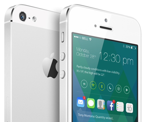
iOS 7 may only have been around for six or so weeks, but already, some are looking ahead towards its eventual successor, iOS 8. There’s no doubt that, at least in terms of design, iOS 7 has been the biggest jump in the operating system’s lifespan, but like any piece of software, there’s still plenty of room for improvement both to looks and general functionality. With this in mind, designer Sangam Bhandari has come up with a rather beautiful concept of iOS 8, and even though we do like the changes Apple and Jony Ive have made with 2013’s release, it’s hard to pick holes in this elegant, ingenious figment of Bhandari’s imagination.
The whole idea encircles a revamped home screen, which is a great deal more functional than the current grid of app icons. In spite of the alterations made over the past twelve or so months, it cannot be denied that the home screen is still fairly one-dimensional, but Bhandari’s concept turns this completely on its head.

It works almost as an amalgam of the current Notification Center and Control Center, bringing hordes of information to the fore at a glance. By flitting between icons of your notification-intensive apps – Mail, Messages, Phone et al – you can readily check your notifications directly from your home screen. Presumably, you could also tap on these notifications and deal with them there and then, without the need to open said app, although this is not explicitly detailed in the concept.
As well as functioning a lot better, the concept has a generally inviting and engaging feel to it. A smartphone interface, or any interface for that matter, should be designed to play as nicely with the usership as possible, and this iOS 8 concept really does.
The great thing about this iOS 8 concept is that, despite having much going on, it still manages to look fairly minimal. It’s not overly cluttered with unnecessary add-ons, and as big fans of simple, understated design here at Redmond Pie, we’d definitely call this one a winner.

What do you think? Would you be impressed if, come next year’s WWDC, Apple unveiled something along these design lines, or are you happy with how iOS 7 looks like in its current form? Do share your thoughts below!
(Source: Behance) (via: CultOfMac)
You can follow us on Twitter, add us to your circle on Google+ or like our Facebook page to keep yourself updated on all the latest from Microsoft, Google, Apple and the Web.

