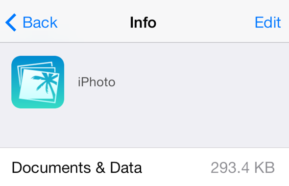
It’s amazing what you can find when you go digging through various sections of Apple’s iOS operating system. Those who have the knowledge and patience to delve into the inner workings of the software can often encounter some extremely interesting things that Apple may or may not want the average user to immediately know about. Before iOS 7 and the iPhone 5s was officially announced it was revealed that the OS contained references to biometric frameworks; a discovery that pretty much confirmed the existence of Touch ID. Now it seems like it’s the turn of a couple of Apple’s own iOS app offerings to come under the spotlight after new icons were discovered for the iOS versions of GarageBand and iPhoto.
As noted first by 9to5Mac, It shouldn’t come as any great surprise that the newly discovered icons seem to follow the overall iOS 7 design trend by appearing a lot "flatter" and minimalistic. The use of faded but vivid turquoise blue and deep orange may not be to everyone’s personal tastes but the icons show a willingness by Apple to boldly venture into territory that we never thought they would enter into. With that said, when looking at the two icons side-by-side it’s hard not to conjure up thoughts of Grand Theft Auto: Vice City and late 70’s Hawaiian imagery (or is that just me?).

Although the icons aren’t currently being used as the main installed options for the two apps, they can still be found on the device. Anyone running iOS 7 with either iPhoto or GarageBand installed can head over to Settings App >> General >> Usage and select the Manage Storage option that appears in the second section of the tabled view. With Apple already confirming that their next media event will be held on October 22nd, it’s entirely possible that the "we still have a lot to cover" tagline could include showing off some newly designed internal apps.

These new icons that are displayed in the Manage Storage section of the iCloud settings are actually served up remotely from Apple’s servers. We could be seeing these two new icons down to an internal error or purely down to the fact that someone at Apple has jumped the gun and provided the wrong artwork to the server. None of the other important apps in Apple’s arsenal are showing up as having redesigned icons so it’s likely that is by accident rather than choice. Still, the October 22nd event is shaping up to be a good one.
You can follow us on Twitter, add us to your circle on Google+ or like our Facebook page to keep yourself updated on all the latest from Microsoft, Google, Apple and the web.

