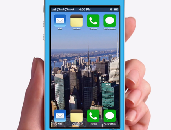
A new concept video for iOS 7 features has just been released by designers Christian Lue and Ran Avni, which takes into consideration the lack of functionality with iOS Messages, revamps Siri, and offers a whole host of other interesting tidbits. More details, as well as a video demonstration of the design, can be found below.
We’re not too far away from WWDC 2013, and iOS 7 is definitely atop the agenda. Sir Jony Ive is thought to be taking a much flatter, cleaner approach with the user interface, and while we’ve heard rumors and snippets pertaining to the kinds of changes we are to expect, nothing can really be banked until we see the grand unveiling.

Until June 10th, we’ve to make do with our own thoughts and expectations, and the concept makers have been busily churning out new ideas on an almost daily basis. Many have simply sought to visualize a flatter, lest skeuomorphic look, but this latest one from Lue and Avni takes a ground-up approach in revamping the functionality of a number of key areas.
As you will see from the demonstration below, there’s a long overdue Quick Reply feature, making it easy to respond to messages without interruption. Those among the jailbreak community have been treated to the likes of BiteSMS, which offers this feature as standard, and one hopes the Cupertino has been paying attention.

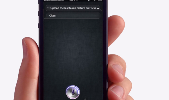
Siri was first introduced with iOS 5 back in 2011, but like so many iOS features, has lied fairly dormant ever since. This concept reimagines the voice-recognition app, strongly integrating numerous stock apps while also making strong ties with the rumored Flickr and Vimeo integration.
Settings are also expanded in the concept, presenting a host of in-depth options running deeper than the surface. Up until now, iOS has been extremely difficult to tailor to one’s specific needs without a jailbreak, but with options like folder-in-folder, icon sorting and auto-close, the user would retain an element of unprecedented control over the behavior of their iPhone, iPad or iPod touch.

The Music app has also been given a nice cosmetic update along with a bunch of nifty – or should we say, handy – little features. Up Next is a part of the Music app now, tapping on the currently playing song in the Now Playing section gives you a sneak preview of the songs which are in line. Brilliant stuff we must say, and handy, too.
And oh, did we mention that this concept also features panoramic wallpapers? Yup, it’s there, just like how it is on Android. Sliding through the different home screens will also subtly scroll through the wallpaper, giving the user a great sense of openness.
Overall, we’re very impressed, because as well as looking great, this concept shows a degree of innovation that has been sorely lacking through the past view generations.
Check out the full demo video below, and be sure to let us know of your opinions in the comments section!
You can follow us on Twitter, add us to your circle on Google+ or like our Facebook page to keep yourself updated on all the latest from Microsoft, Google, Apple and the web.

