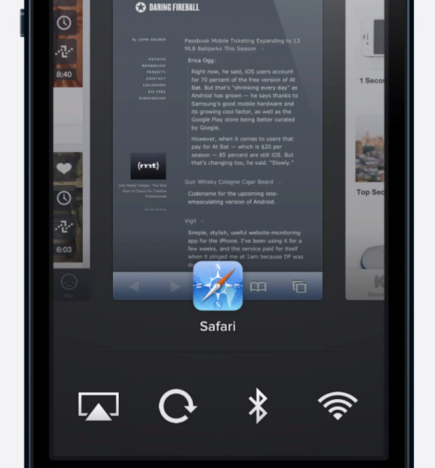
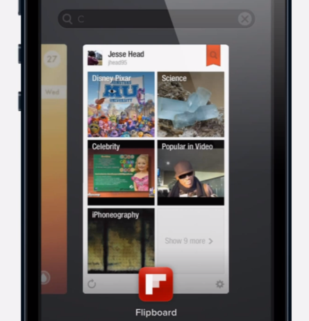
iOS 7 is largely expected to make an appearance at this year’s WWDC, and under the influence of Jony Ive, some are expecting more radical changes than previously seen under the guidance of Scott Forstall. Ive doesn’t strike us as somebody who finds it difficult to dream up new designs, but if he and his team were ever stuck, they could always turn to the multitude of designs offered by Apple fans across the world. We’ve seen many an iOS 7 concept during the past six months, but this demonstration of a revamped “App Switcher” concept by one Jesse Head has left us relatively awestruck.
The app switcher / multitasking bar – whatever you want to call it – has been the subject of increased scrutiny from the get-go. The problems? It’s one dimensional, there’s no preview functionality, it’s difficult to close many apps in one hit.. the list is endless. Many have tried to improve the situation, with standouts including the jailbreak tweak Auxo, but with Apple always steadfast in stopping the jailbreak scene in its tracks, it’s not a viable, long-term solution.

What would be great, is if Apple and Jony Ive would overhaul the system, and as we continue to wait for WWDC’13, Jesse Head’s solution does a great job of presenting an innovative system. Featuring live previews, it takes the idea of the aforementioned Auxo tweak, but goes one further by bringing it to the full-screen. This dynamic, faster app-switching does wonders for the user interface, and in a practical sense, works a great deal better than the current configuration.
The active, liveness of the previews is somewhat akin to Windows Phone 8 with its Live Tiles, and would mean users wouldn’t have to categorically open every app in order to check for any changes.
As we continue to hope for some big alterations to iOS in 2013, one suspects this is a step too far. Moreover, the bottom bar, which comes complete with SBSettings-like toggles, may bamboozle the average user, so while we may well continue to dream, don’t expect anything like this to be arriving anytime soon.

What do you think of the App Switcher – would it dramatically improve the look and feel of iOS? Or is the current app switcher just fine as it is? Please do share your thoughts via the usual mediums below!
Thanks Marco, for the hat tip!
You can follow us on Twitter, add us to your circle on Google+ or like our Facebook page to keep yourself updated on all the latest from Microsoft, Google, Apple and the web.

