The closer we draw to WWDC and the imminent announcement of the eagerly-awaited iOS 6, the more rampant and seemingly audacious the rumors are getting. From what we’ve gathered so far, the sixth edition of Apple’s iconic mobile operating system will feature a brand new, Cupertino-inspired Maps app, Facebook integration, Baidu Search, and a whole host of other delicious features.
Still, with just days until the Worldwide Developers’ Convention kicks off, there’s no harm in dreaming about what Tim Cook’s company may have up its sleeve, and designer Joost van der Ree has done exactly that in piecing together a quite wonderful concept.

Rather than being based upon rumor, van der Ree has checked out some of the wish lists of tech enthusiasts and assembled the dream combination. The concept, which arrives in the form of a YouTube video, offers four key new improvements on the current state of play in the categories of multitasking, app preview, Notification Center and app notification badges.
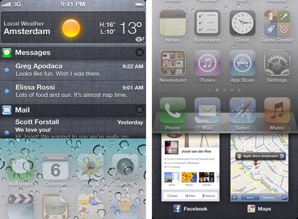
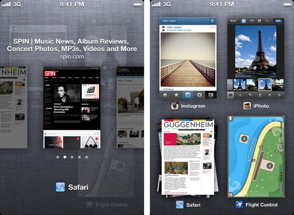
Bearing in mind the gradual merging of iOS and OS X, van der Ree re-thinks iOS 6 multitasking in the image of Mission Control, and as you can see, in theory at least, it works quite sumptuously. You can preview app icons by scrolling vertically, and in apps where multiple tabs / pages are used, once can preview them in a "stacked" manner, pinpointing not only the app you want to use, but the exact portion.

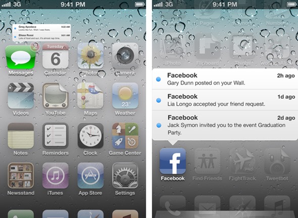
iOS 5 brought the annoying notification system to an end with the simplistic, clean, and well-functioning Notification Center, but van der Ree really takes things to the next level with what he refers to as dynamic badges. A simple swipe over a badged icon brings about a white pop-up enabling those unread notifications to be dealt with, which is not only more productive, but adds a touch of finesse to the home screen as a whole.

Saving the best till last, "Flipcons" offers a preview of app updates in the form of a gallery, and this feature is especially tailored for the social and newsy apps such as Flipboard. As you can see from the video, it works really nicely, and allows for deeper interaction with icons that might otherwise fester on your device’s home screen.
Although we look at these features more in hope than expectation, it’s certainly an impressive concept, and despite knowing of many upcoming features, there’s sure to be plenty of surprise once WWDC kicks off on Monday.
(via MacStories)
You can follow us on Twitter, add us to your circle on Google+ or like our Facebook page to keep yourself updated on all the latest from Microsoft, Google, Apple and the Web.

