Apple has, save a few well-documented howlers along the way, steadily improved iOS through generations. With that said, there’s certainly scope for much improvement, and TheVerge user brentcas has had a pop at suggesting some amendments to one key area in particular need of updating and improving – the lock screen.
Like many features of the Cupertino company’s iconic mobile ecosystem, the lock screen has seen precious little in the way of change, and although its functionality is markedly higher now than it ever has been thanks in part to the camera slider, it’s still a very limited feature of iOS as a whole.
You look at the live tiled interface of Windows Phone, and you realize that, even when a device isn’t in use, it can still benefit the user by showing up useful information. Brentcas has taken this motif and quite delightfully applied it to iOS by means of concept designs, and if Apple were to take a leaf from his book, I’m sure many of us would be grateful recipients.
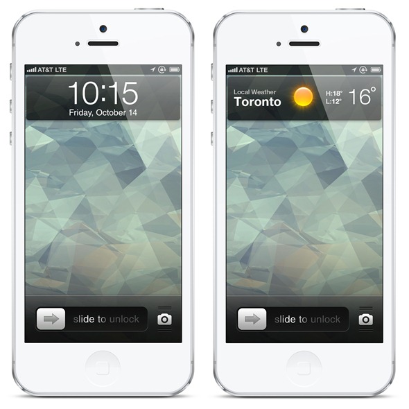
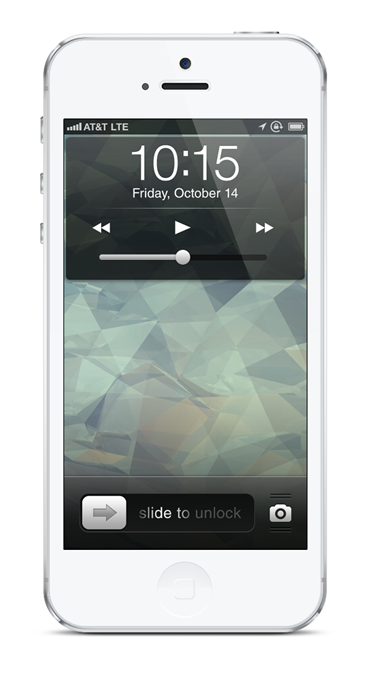
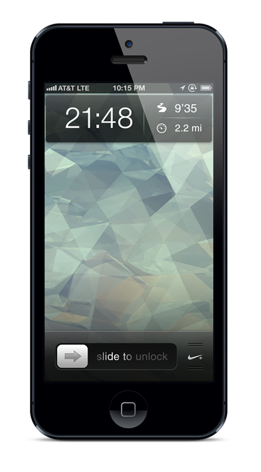
The first idea, named "Lockscreen Cards," are essentially widgets taking the form of cards. You can slip between the cards as you would a deck of real cards, checking out information from the various connected apps. As an extension of the cards feature, a double-click of the home button also initiates additional information or controls relevant to that specific app.
In terms of general behavior the cards would operate in the archetypal iOS format; i.e the long press would bring about the jittering, enabling cards to be moved about, and a home button press would simply return you to the main card.
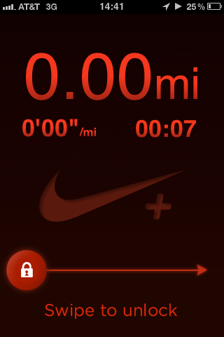
The cards would work in terms of priority in order to get the job done efficiently. For example, when you begin running using the Nike+ app, your miles, pace, and time on the app would be shown on your Running card, which will have moved to the front of the deck.
As well as cards, brentcas has also expanded on the camera slider idea, which, in short, would let you integrate any app into this particular function. You could update your Facebook, Check-In with Foursquare, and basically do whatever you like.
To conclude the piece, the poster also spoke of a kind of general "ranking" system for lock screen notifications based on importance, and he’s right. At present, a game notification – with the same settings applied – bears as much relevance in the notification system as an e-mail, which is fundamentally wrong. He touches upon the idea of a three tier system of ‘light notifications,’ ‘heavy notifications,’ and ‘temporary takeovers’.
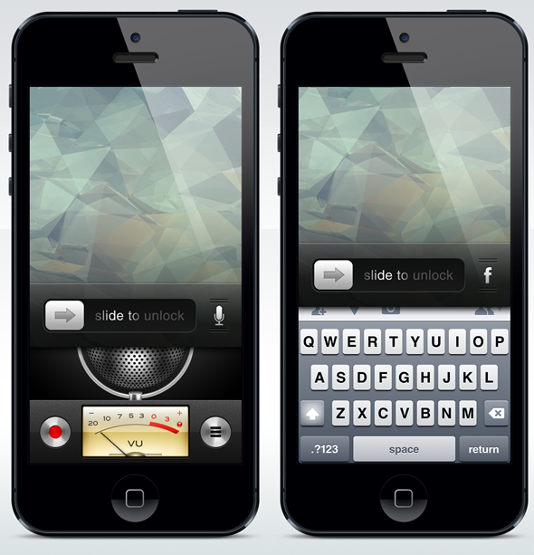
Light notifications would reflect general things like "Take your turn on Words With Friends," heavy notifications would be a little more in your face for things like calls and FaceTime, while temporary takeovers would demand the undivided attentions of your lock screen for things like Maps directions and Voice Memos.
With Jony Ive now said to be having more creative control over the design and functionality of iOS moving forward, we’re expecting some significant alterations with iOS 7 and beyond. Obviously, we have no idea what they will entail just yet besides a perceived crackdown on skeuomorphism, but if he shares similar values as this particular tech fan, we could finally see a lock screen offering something for the user beyond the patented "slide to unlock," music controls, camera slider, and basic notification system.
You may also like to check out:
You can follow us on Twitter, add us to your circle on Google+ or like our Facebook page to keep yourself updated on all the latest from Microsoft, Google, Apple and the web.

