The dismissal of iOS SVP Scott Forstall at Apple, which has led to Jony Ive taking the helm in the future direction of the company’s mobile software, has brought a whole new impetus on the prospect of iOS 7. With Ive said not to be a fan of the skeuomorphic designs throughout iOS, they’ll likely go the way of the dodo, but it’s not just the faux leather and paper expected to be updated when the next generation of iOS software eventually arrives next year.
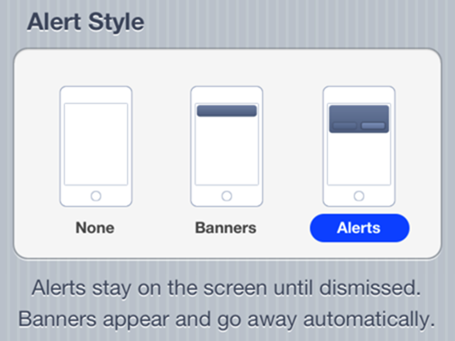
The system of alerts / notifications is still in need of improvement. Sure, iOS 5 brought the banners and Notification Center, but since iOS 6 didn’t really extend the capabilities of how one is notified of a message, e-mail or Reminder, it still feels a bit like an outdated amalgam of iOS 4 and iOS 5.
Now Ive has taken over, that could all be about to change, and naturally, some intuitive folk are already looking into ways Ive could perhaps whip the notification system into shape. Among them is TheVerge user Sentry, who has thought up a very intriguing system that combines the banner with the pop-up alert to create a unique, altogether more productive way of dealing with notifications.
As explained by Sentry, the banner system brought a welcome air of minimalism to proceedings, but by maintaining the old alerts, Apple did not deal with the extremely obtrusive nature of the pop-up. As well as that, they both look different what with the banner being white and opaque, while the alert is translucent blue. Since the latter has remained unchanged throughout the various iOS generations, a more uniform look should be something for Ive to consider moving forward, and we’d have to say the work of Sentry is in sync with our hopes for iOS 7.
As somebody that uses BiteSMS religiously (it’s the main reason my iPhone remains on iOS 5, after all), I can sure see the resemblance here in Sentry’s design. The Quick Reply feature depicted is already available to anybody using the popular jailbreak app, and if Ive were to add similar dynamics at stock level, there would be more than a few jubilant iOS users.
You can follow us on Twitter, add us to your circle on Google+ or like our Facebook page to keep yourself updated on all the latest from Microsoft, Google, Apple and the Web.

