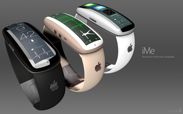
Antonio De Rosa, leader of ADR Studios, frequently dazzles us with some great Apple-centered concepts, and today, has delivered another neat design based on the company’s supposed wearable tech endeavors. The iWatch, as it is unofficially known, looks set to finally make an appearance at market in 2014 after years of speculation, and De Rosa has given us yet another visual representation of what it might look like when it does finally manifest. The ‘iMe,’ as he has called it, features a strap not too dissimilar to that of the Nike+ FuelBand, and with a slick, curved display, much like the Gear Fit, looks rather different to the currently-available smartwatches from the likes of Pebble, Samsung and Sony. Check it out after the break!
Tim Cook has already hinted that Apple has some exciting devices to reveal in the "new products" category this year, and although is isn’t necessarily allude to the release of an iWatch-like device, the fact that the company was reported last year to have a team of over one hundred developers working on it suggests that Apple will finally be following the lead of other big names by releasing a wearable gadget.
Although we’ve very little idea of what the so-called iWatch will look like, what kinds of features it will include, or the sort of price point at which it will enter the market, De Rosa has had a pretty good go at answering the first two questions with his iMe concept.
All of the smartwatches we’ve seen hitherto have been fairly basic in terms of design, packing a standard display and strap, but iMe takes things a step further, with a curved display that pivots to reveal a camera along with what appears to be a home button. Along the side, you’ve physical buttons like volume and the hold toggle, and the interface is touch-based, ready to respond to your every whim.
The focal point of iMe, aside from being a very personal device, is found in its health-enhancing credentials. It packs a heartbeat monitor and dedicated health app, essentially negating the need for the likes of the FuelBand, which Apple currently sells via its Online Store.
The body itself is comprised of aluminum and liquid metal, but although this would provide a sturdy, high-end finish, we’re a little unsure as to the overall design. The strap, taking cues from the FuelBand, is a definite winner, as is the clasp, but the main digital unit looks a bit too much like a digitized computer mouse for our taste.
Nevertheless, it must still go down as one of the better iWatch concepts we seen, and after you’ve feasted your eyes on the renders below, be sure to leave your thoughts and critiques via the comments.
(Source: ADR-Studio)
You may also like to check out:
You can follow us on Twitter, add us to your circle on Google+ or like our Facebook page to keep yourself updated on all the latest from Microsoft, Google, Apple and the web.

