Just hours ago, we reported on a leak that revealed a new photo sharing app Facebook has been working on. We’re now getting our hands on even more screenshots showcasing other features, such as commenting features built right in, as well photo capturing (although that wasn’t all that surprising).

Instead of nagging you with boring details, we’re cutting it straight to the chase: below are some of the features we found the most compelling from the mockups.
Photo capturing and sharing built right in:
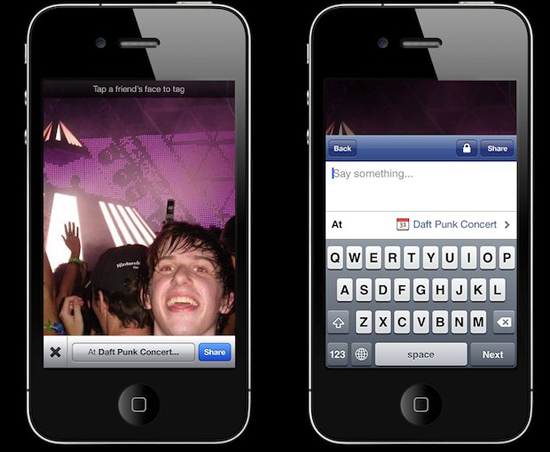
As expected, this new app seems to allow users to capture pictures straight from the camera App. The capturing feature looks and feels very similar to the native iOS camera app, as you can tell from the pictures below:


Once users are done taking pictures, they can choose whether to share them or not. From the sharing screen, users can also insert tags if they’d like. Users apparently won’t be forced to share pictures right away either:

Single Shot and Multi-Shot Modes:
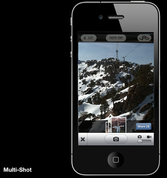
More interesting, this app seems to have two modes: single shot and multi-shot. While the former seems to be meant to be a quick way to take a photo, tag it, assign it to a place (yes, you can do that) and submit it; multi-shot lets you do the same thing, only with many pictures, presumably for big events, such as parties:
"Likes" and Comments:
This app will also be able to display likes and comments, as expected. Although the mockups below don’t look anywhere near finished, they hint at a possible slide-up function in order to unveil comments on any picture. We’ll have to see where this goes:
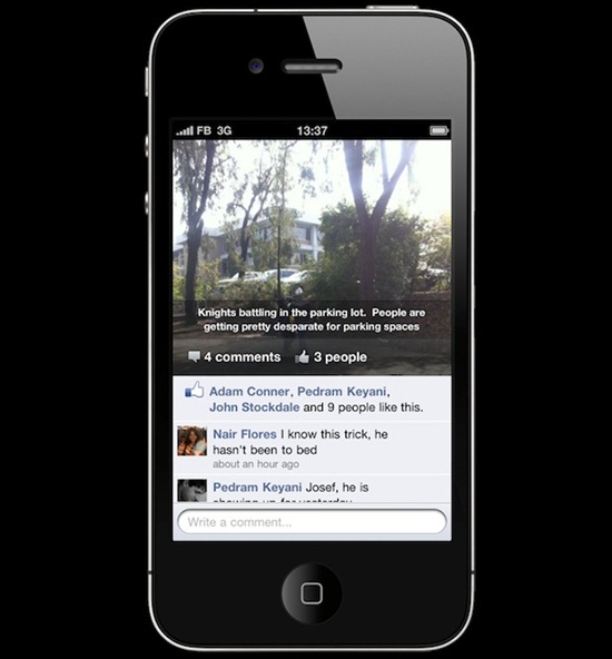
As you might expect, these mockups should look like early iterations of what the final app might look like. Some of the features, such as comments, look like they were taken straight from the the standard Facebook App (already available) without any kind of tweaking, or even retrofitting. Comments and location features will likely share the app’s overall dark and crisp look and feel, unless it gets scrapped when the final version comes out.
It’s also possible that all these features simply get folded into the standard Facebook app, although the company might be looking to do otherwise. You can check out my write-up on the matter here.
(Check out TechCrunch for more mockups and tidbits)
You can follow us on Twitter or join our Facebook fanpage to keep yourself updated on all the latest from Microsoft, Google and Apple.

