I came across these images of Microsoft Home, on Paul Thurrott’s Supersite for Windows. While, I’m very much fascinated by the cool gadgetry and hi-tech integration of Internet and devices in that place, what caught my eye were these images.
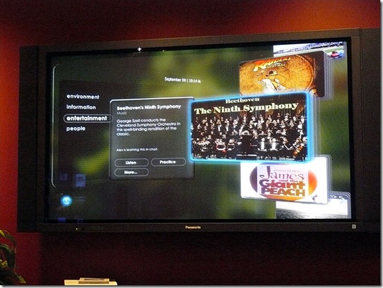
This is an image of the Media Center Prototype, which is in working condition, as it’s being displayed at the Microsoft Home.
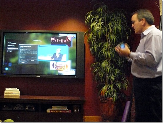 The Media Center Prototype being controlled with the phone.
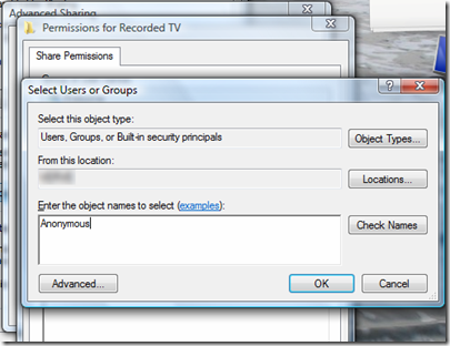
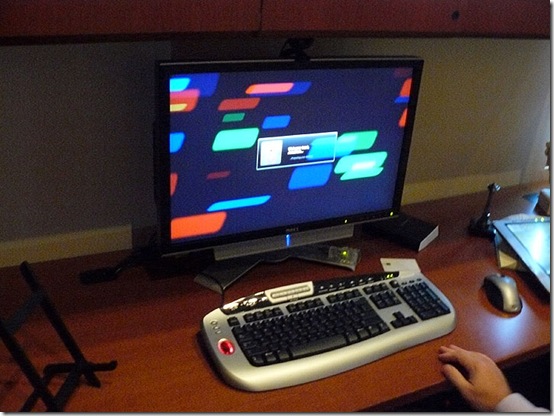 Yes, as you can see, not even Microsoft Home has shifted to Vista. Talk about setting an example for others.
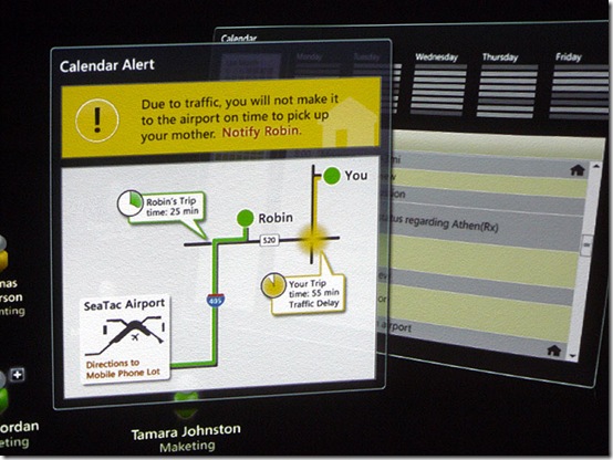
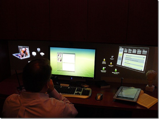 As shown from the screens in the right and left, it’s all 3D. Hmm, Microsoft? May I have this OS interface for Windows 7, please?
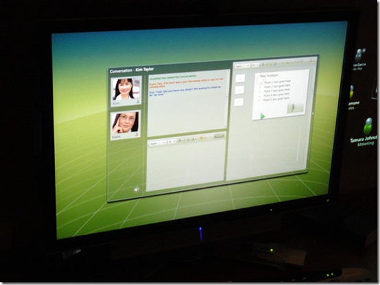 A conversation going on in the highly ‘glassed’ window. Where’s the taskbar?
I like this screenshot . Notice how the window in the background is tilted in 3D. And the glass effects look much cooler.
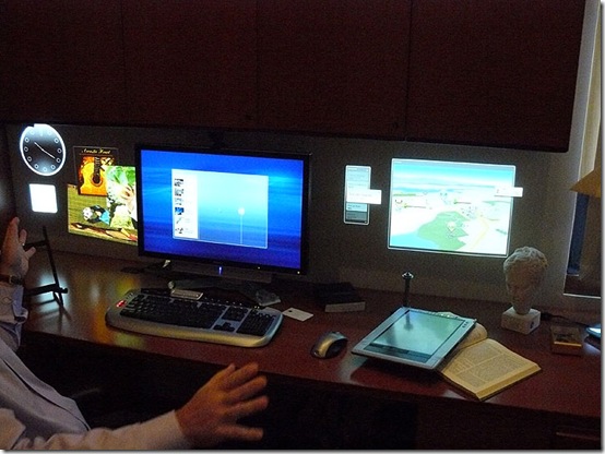 No Microsoft Home can be complete without a Tablet PC. Are those Sidebar Gadgets on the left?
Some very cool prototypes, specially the Media Center ones, since the OS doesn’t seem to have much going on. Now, only if Microsoft would use this prototype for Windows 7 Media Center.
Where should I send my feedback? Sinofsky? or Ballmer?

