iOS and Mac fans heavily lamented Google’s acquisition of the popular Sparrow app last year, for the first move made under the new ownership was to discontinue any further support for those particular versions of the app. Such was the height of the regard in which Sparrow was held that nowadays, near enough every new mail app is immediately compared with Sparrow. Thus, it would seem a matter of formality that we’d pit Mailbird, a new, Windows-only Gmail app, against the old favorite. But aside from the fact that email power users refer back to Sparrow as a matter of habit, Mailbird, which is currently in public beta, bears a number of striking similarities to an app which strongly influenced the way we deal emails in the modern day.
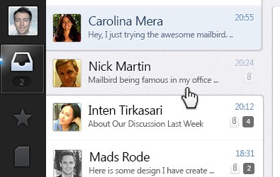
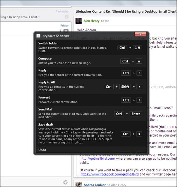
When it comes to sending, receiving, and generally managing email, a clean, functional interface is almost as necessary as an Internet connection. As you can see, Mailbird’s is very easy on the eye. Divided up into three key areas, you have your Gmail inbox over on the left, your conversations in the middle, while all other relevant information is situated on the right-hand side.

You can readily adjust the size of the left pane to show / hide labels, a feature quintessential of Sparrow in its heyday. Meanwhile, the nifty quick response option allows you to quickly deal with your emails in the daily rush, but if you need a little more time to mull over what you’re writing, you can also open up a larger compose window, which naturally arrives complete with all of the relevant formatting options.

But while Mailbird appears to pay a charming homage to Sparrow, it’s not short of a few interesting features of its own. The "apps" section, for example, essentially allows you to bring add-ons into the fold – increasing an application’s functionality along the way. The apps section is of the open-source variety, so any third-party dev is free to hop on and try and improve the general user experience, and although options aren’t exactly abundant within this fledgling beta app, the idea could certainly catch on as the Mailbird gathers a flock of users.

With support for only one email account, Mailbird is certainly not the finished article, and if, like most, you use numerous email addresses on a daily basis, you’re probably not going to want to try the beta. But with a clean interface and potential in the add-ons feature, there’s no reason why this couldn’t eventually evolve into the next Sparrow; question now is, will the developers get on board?

For more information regarding Mailbird and where to download, simply point your browser to getmailbird.com/home/, and let us know if you think it has potential by dropping a comment via the usual mediums below!
You can follow us on Twitter, add us to your circle on Google+ or like our Facebook page to keep yourself updated on all the latest from Microsoft, Google, Apple and the web.

