A lengthy interview with Apple design chief Jony Ive has been published today, with Ive laying out some of the thinking behind the design that went into the new MacBook Pro, as well as why the company decided on the Touch Bar, as it is now known, rather than a more traditional full touchscreen notebook computer as some of Apple’s competition has.
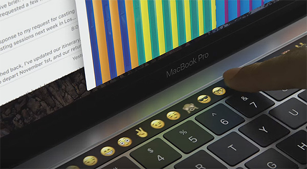
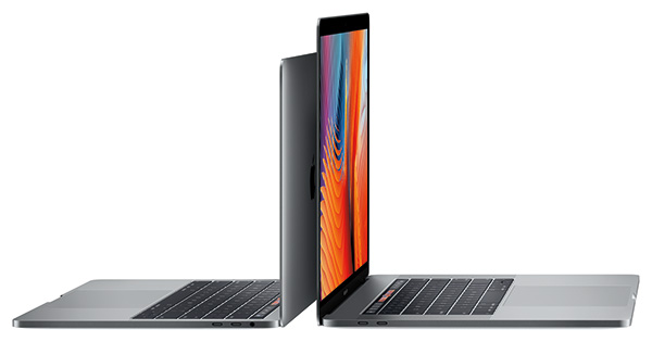
Apple’s newly-announced 2016 MacBook Pro features an OLED touch-based panel across the top of the keyboard, where the function keys used to be, which can be changed and adapted depending on the software currently being run and the task being completed.

This removal of physical, static buttons and replacing them with more lively, touch-based ones is one that has the potential to be a huge new input source for Apple’s MacBook Pro users, but creating it wasn’t straightforward. As Jony Ive points out, “a number of designs” were tested before the final offering was put together.
He explains: “When we lived on them for a while, sort of pragmatically and day to day, [they] are sometimes less compelling. This is something [we] lived on for quite a while before we did any of the prototypes. You really notice or become aware [of] something’s value when you switch back to a more traditional keyboard.”
However, as Ive went on to explain, perhaps the hardest part of the process is taking a design and turning into a shipping product without detracting from what the original design stood for. Over the years, plenty of companies have had great designs that they just couldn’t quite pull off at scale or simply did not suit the product for which they were intended. Apple, it seems, is acutely aware that great design does not always guarantee great results.
“You sort of change your hat, because you have to figure out how do you then productize it, and develop the idea, and resolve and refine to make it applicable to a specific product. To do that in the context of the MacBook Pro — while at the same time you’re trying to make it thinner, lighter and more powerful — the last thing you want to do is burden it with an input direction that now has a whole bunch of challenges specific to something like touch.”
On the full touchscreen Macs, Ive had this to say: “When we were exploring multitouch many, many years ago, we were trying to understand the appropriate application and opportunities for [it]. We just didn’t feel that [the Mac] was the right place for that…. It wasn’t particularly useful or an appropriate application of multitouch.

Apple’s Touch Bar has the potential to be a huge game-changer for users of Apple’s high-end notebooks, and with expectations that Touch Bar will make the jump to other machines in due course, the row of buttons at the top of your Mac’s keyboard could be obsolete sooner rather than later.
(Source: CNET)
You might also like to check out:
- 8 Things Apple Killed In 2016 MacBook Pro
- 2016 MacBook Pro Vs Surface Book 2 i7 [Specs Comparison]
- 2016 MacBook Pro: 13-Inch Vs 15, Touch Bar / ID Vs Without Model [Specs Comparison]
- 2016 MacBook Pro Vs 2015 MacBook Pro Vs MacBook Air Buyers Guide
- Magic Keyboard With Touch Bar: Here’s How Apple Could Bring It To The Desktop Mac
- Touch Bar In MacBook Pro Runs eOS, A Variant Of watchOS, And Is Powered By Apple T1 Chip
You can follow us on Twitter, add us to your circle on Google+ or like our Facebook page to keep yourself updated on all the latest from Microsoft, Google, Apple and the web.

