After being unveiled last September, and subsequently delayed, the long-awaited overhaul of iTunes was finally released to the general public on Thursday. Over 10 years ago, Apple unveiled its jukebox software to the world: innovative at the time, it has become more bloated and complicated over the years.
This time, the Cupertino company has decided not only to dramatically simplify the software while keeping all of its important features, but also give it a fresh new look that should please old and new users alike. If you haven’t used iTunes recently, we think that this might be a good opportunity to give the player another shot.
The jukebox’s new look represents a slight change of direction for Apple: the sidebar has been completely done away with, and replaced by a dropdown menu featuring Music, Movies, Podcasts, Books, Apps and other forms of media purchasable through iTunes, and devices are now shown on the right side of the same top bar.
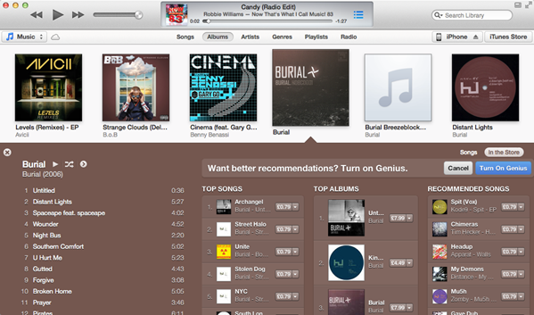
Another great design change is the album view, already present in the previous release but greatly enhanced in iTunes 11. When clicking on albums, instead of being taken to a whole different page, the view simply expands to display all of the songs in the album. I personally find this view both beautiful and practical:
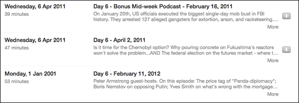
Other views have also received minor changes, bringing them more in line with their iOS counterparts. The most interesting change has been the default Podcast view (creatively named ‘Podcasts’), which blurs the distinction between downloaded and available podcast episodes. While I personally welcome this change, it might confuse some:
Enhanced Playback Features
There are some interesting new playback features that should greatly please casual users who might not have huge music libraries or enough time to make playlists.
Up Next
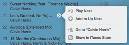
iTunes 11 features a new music queue, named “Up Next”, that features upcoming tracks. Adding tracks or albums to this queue simply involves right-clicking the item and choosing “Play Next”.
This feature allows users to quickly build a sequence of tracks by adding them to the “Up Next” queue, then, well enjoy.
History
There is also a “history” icon, which allows users to view recently played tracks.
Unfortunately, there is no way to save these sequences as playlists for later use. This is something I wish Apple had added for future use. However, all of the playlist features (for creating and playing back playlists) from previous versions of iTunes are still built in, under a section creatively named “Playlists”.
New MiniPlayer
In previous version of iTunes, its mini-player, meant to provide users a distraction-free way to control their listening experience, has turned out to be more of an annoyance than a benefit. With iTunes 11, the player is smaller but it actually does what it’s meant to do: allow highly productive users to control their music without getting off their Internet surfing or Excel spreadsheets.
The new “Up Next” list is also built into the mini-player. More interesting, however, is the ability to search for tracks without maximizing iTunes: just thought of a tune and wish to listen to it? That’s 3 clicks away.
Deeper iCloud Integration and New Online Store
Apple has refreshed the iTunes store for the first time for a few years. All of the content is much more easily accessible. A new feature, “Preview History”, is a variation of the aforementioned “Up Next” queue for music preview: while previewing songs on the iTunes store, each song previewed is added to this list. You’re now free to browse around without keeping track of all of the tunes you’ve looked at – once you’re ready to make a purchase, you can do so straight from “Preview History”. From our experience, this feature is quite buggy, with previewed tracks often not displaying in this list right away: hopefully this issue will be fixed in a future release.
Remember the Album View referred earlier? The new iTunes store is built right into this new view, allowing users to view recommendations for the albums that they’ve previewed under the new “In the Store” tab. These can either be similar songs or unpurchased tracks from the selected albums.
iTunes 11 also deepens the integration between devices using iCloud. Items purchased from other devices, such as an iPhone or iPad, will now instantly show up in iTunes 11. Moreover, Automatic Downloads means that media purchased from other devices can also be automatically downloaded to your local library with no user intervention. Enabling this feature is just a few clicks away from the iTunes settings.
Download Manager
Worried about so many downloads cluttering the user interface? The download manager is now cleverly hidden away as a button at the top of the screen. Shown whenever any downloads are pending, it can be easily brought up when needed… but only when needed.
Redeem Gift Cards Using Your Computer’s Camera
Another interesting addition, particularly welcome in the holiday (gift) season, is the ability to redeem physical gift cards by simply snapping a picture of them. You can now use your computer camera to redeem gift cards on the fly, straight from the iTunes store.
What’s Missing?
iTunes 11 is an impressive update, with a redesigned user interface and streamlined features. However, there are a few bad apples in this release: thankfully, not about what is actually within this release, but what was left out.
While integration with iOS devices has been greatly improved, it’s still not possible to stream content from device to device. Those hoping for some kind of “all you can eat” monthly subscription feature, adopted by competitors such as Spotify, will also be disappointed: Apple is still reluctant to introduce this.
Windows 8 users will also quickly notice that there’s no integration whatsoever for the new Metro UI. Not that it was expected, but lack of any Windows 8 integration will greatly downgrade the experience of iTunes users on Microsoft’s new operating system.
Don’t get me wrong, however: iTunes 11 is a great release. It’s stable and includes many long-awaited improvements that in addition to pleasing current users, it may compel users of other digital jukeboxes to take a second look at Apple’s alternative. If you’ve recently deflected for any other tool like Spotify, we advise you to try the new iTunes.
You can follow us on Twitter, add us to your circle on Google+ or like our Facebook page to keep yourself updated on all the latest from Microsoft, Google, Apple and the web.


