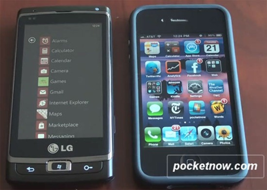
Brandon Miniman of Pocket Now has posted a very interesting video in which he compares the operating / homescreening system of Windows Phone 7 against iPhone 4 running iOS 4.x. Both have certain similarities along with places where WP7 and iOS completely take separate paths.
The differences start straight from the unlock screen. iOS has a very straight-forward lock screen which doesn’t give much information over the standard time and date whereas WP7’s, while being minimalistic, is anything but simple. You can see notifications (along with time/date) right from the lock screen so there is no need to unlock the device to check for updates.
Moving forward, iOS has a very app-centric homescreen system whereas WP7 offers a homescreen that has widgets or, as MS refers to them, live tiles. Users can pin custom tiles to the homescreen that offer little bits of information.
Microsoft’s system is action and information oriented while Apple’s system is focused on apps. Two very different philosophies…
Multi-tasking is definitely better on iOS because of the fast app switching system. Because of this, switching between one app and then another definitely requires more steps on WP7 which isn’t very intuitive at all. The folks at Redmond really need to tackle this issue in a big update. Fast app switching is an absolute must today.
You can watch the details illustrated in the video below:
Check out our Windows Phone 7 Activity Center for all things WP7. [via Pocket Now]
You may also like to check out:
- HTC EVO 4G vs HTC HD2 vs Nexus One [Video]
- Windows Phone 7 vs iOS 4 – Web Browser Speed Test [Video]
- Nexus One Blown Away by iPhone 3GS in Browser Speed Test
- Nexus One with Android 2.2 Froyo Pwns iPhone 4 in Web Browser Speed Test [Video]
- iOS 4 vs Android 2.2 vs Windows Phone 7 – The Inevitable Comparison
You can follow me on twitter or join our facebook fanpage to keep yourself updated on all the latest from Microsoft, Google and Apple.

